DIY No-Sew Black Border Roman Shade Trim

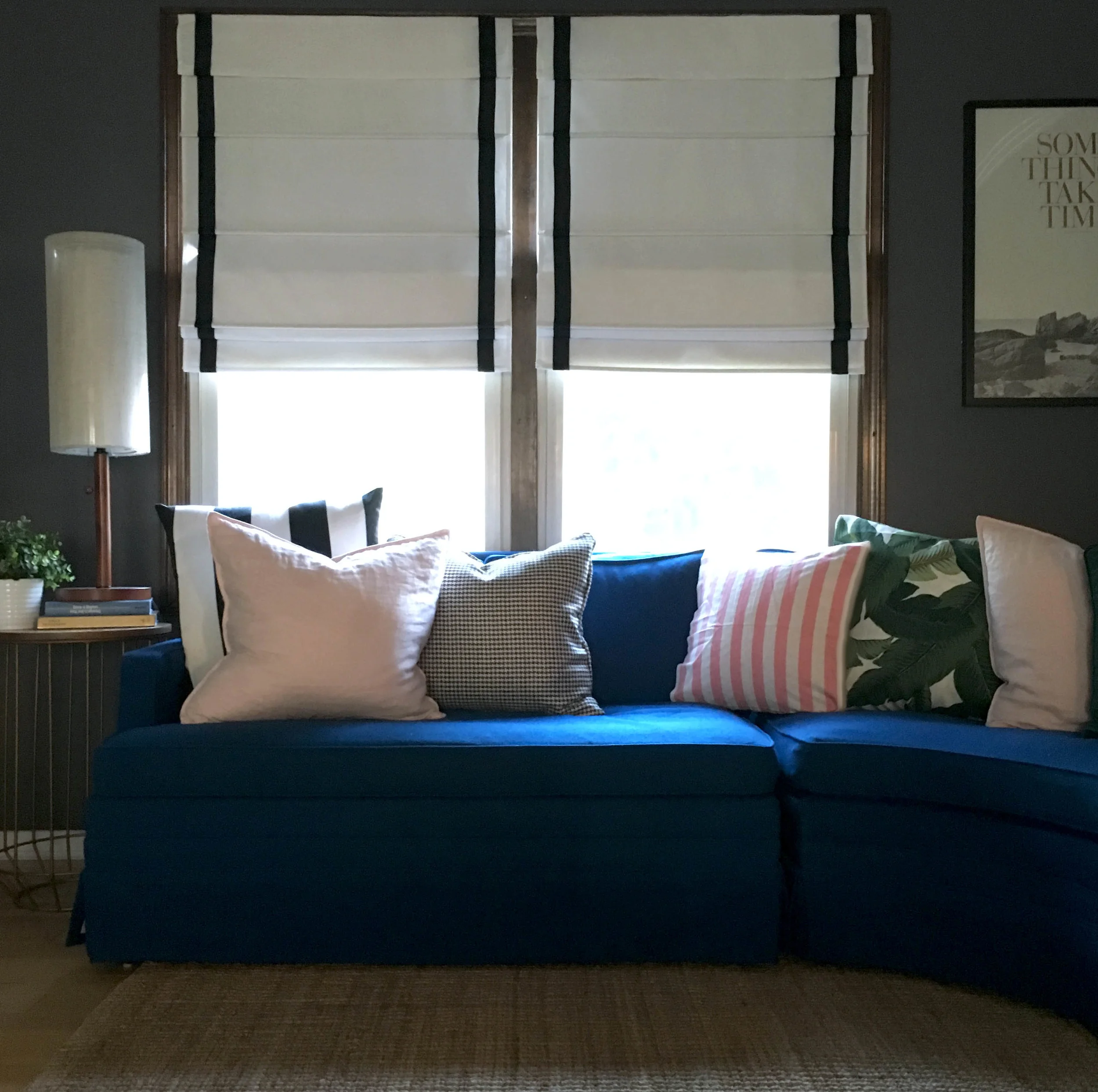
In our house there is a revolving door of furniture swaps--I am forever re-arranging things or buying new pieces on Craigslist and re-listing the old. It's something my husband doesn't always find the most adorable thing about me, but he graciously humors my craziness. When I found this near-perfect cobalt sectional from the 50's it was love at first sight. I think this may be a keeper for the long haul so I desperately needed to address the old window treatments as they no longer worked with this couch in front of them. This space where the sofa is was previously being used as our dining room and while I loved the adorable little elephant curtains, floor length curtains behind the couch weren't really working. 

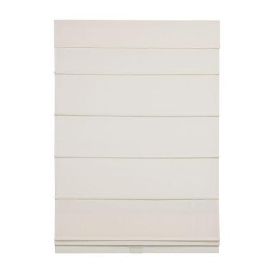
I loved the crisp, classic look of these roman shades with black trim but $120/shade was more than I willing was to spend so I decided to try DIY-ing them instead. My original thought was make the whole shade from scratch, but these lined, cordless blinds were only $40/ea. at Home Depot and came with all the mounting hardware. I spent about $25 total on supplies for both shades, making each one less than $55! Not too shabby!! 

Here is the incredibly easy process I followed for adding black trim to pre-made roman shades. 

DIY Adding Grosgrain Ribbon to Roman Shade


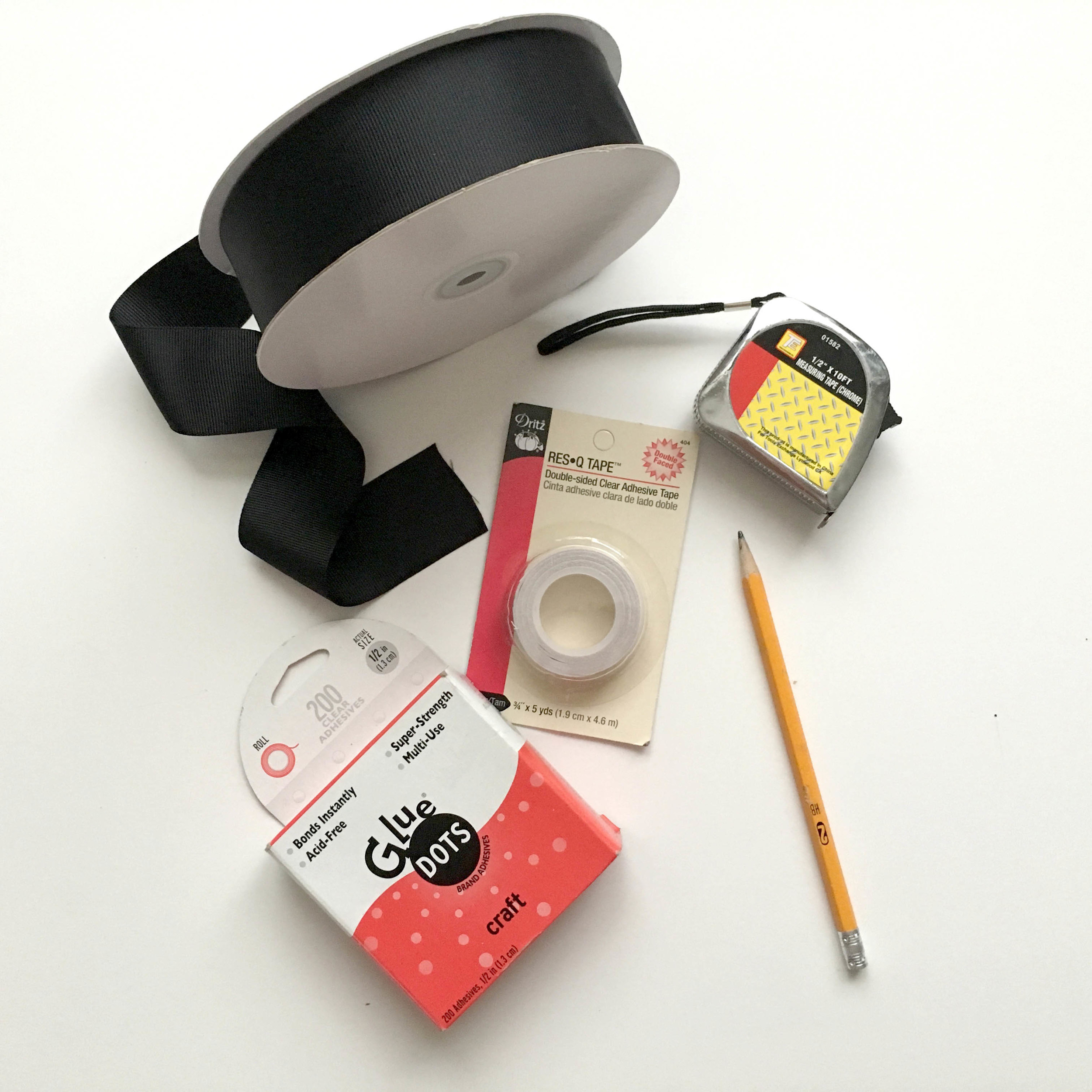
What You Need to Get Started

The list of supplies for this project is pretty minimal and not very expensive. One thing I forgot to show is scissors, but you'll want to have those on hand. 

Stretch Out the Shade

This sounds silly to point out, but the first time I went to work on these it caught me by surprise. Because these are cordless, they kind of coil up when they aren't hung. My solution of piling heavy books on each end wasn't genius or Instagram worthy, but it worked great! 

Roman Shade DIY

Measuring and Marking Where Your Trim Will Go

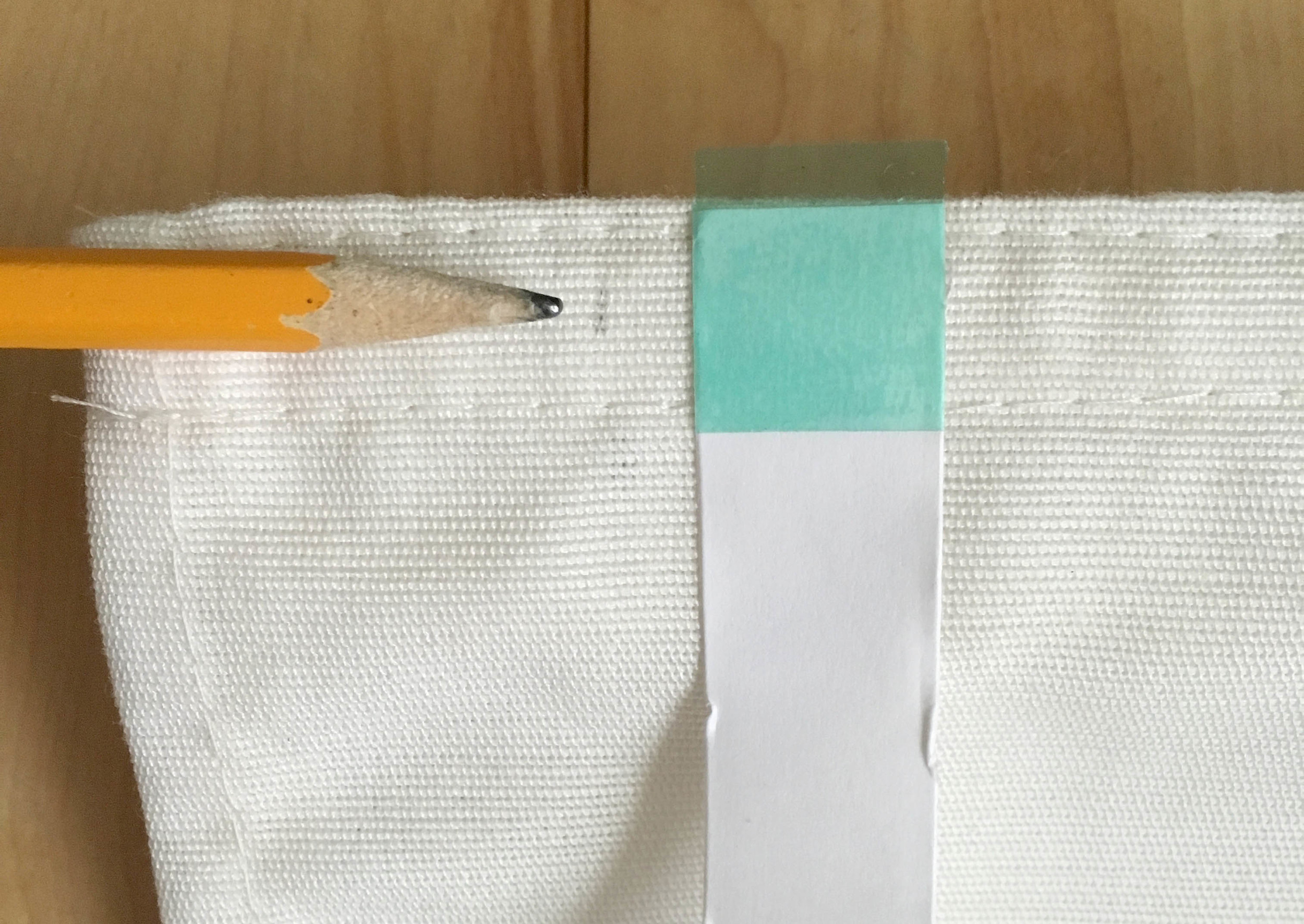
Because my ribbon was 1 1/2" wide I decided to use that same dimension for the amount of the white shade that would show around the outside edge. I think this creates a clean, proportional look. Just measure and make small pencil dashes all around the perimeter of the shade. Be sure to flip up the top flap and mark the underside as well.

Measuring 1.5" for Border on Roman Shade

Applying Double Sided Tape

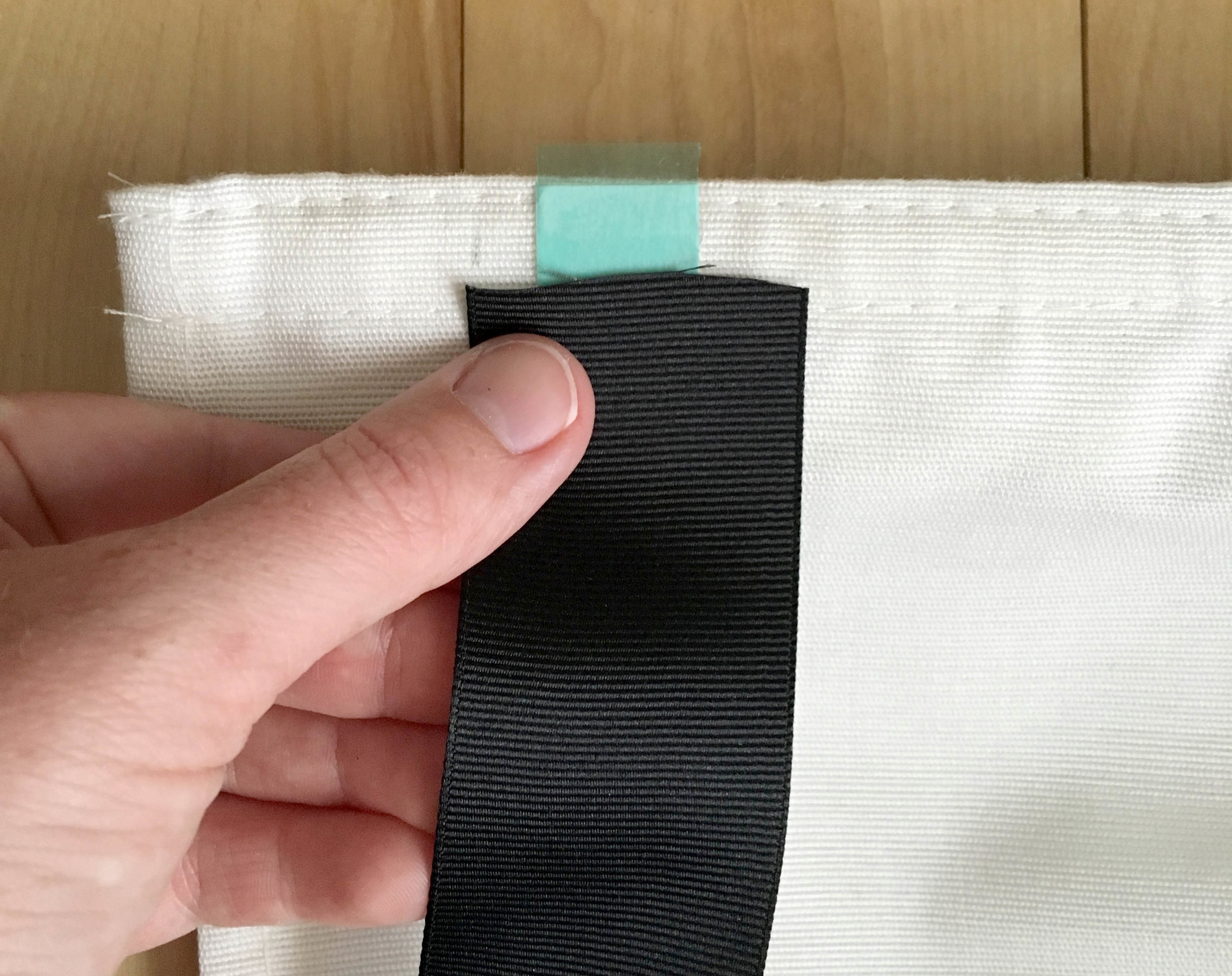
Once you have your pencil marks to guide you, it's time to apply the double sided tape. Rather than lining your tape up with your pencil marks, you want it to be centered with the where the ribbon will be. You can just hold your ribbon up and eyeball the placement. 

Leave the top side coating of the tape in place and be sure to press firmly as you go. When you reach a corner, just cut the tape and start again forming the L shape of the corner.

Using Double Sided Tape to Apply Trim on Roman Shade

If you bought the same, or comparable, supplies as I listed above, then most likely at the very end (for me this is the top flap on the opposite side of where I started) you will run out of tape. Don't worry--we can use the Glue Dots for the last little bit. Leave the section as-is for now and you can address it when you get to that spot with the ribbon.

Using Double Sided Tape to Add Trim on Roman Shades

Adding the Grosgrain Ribbon

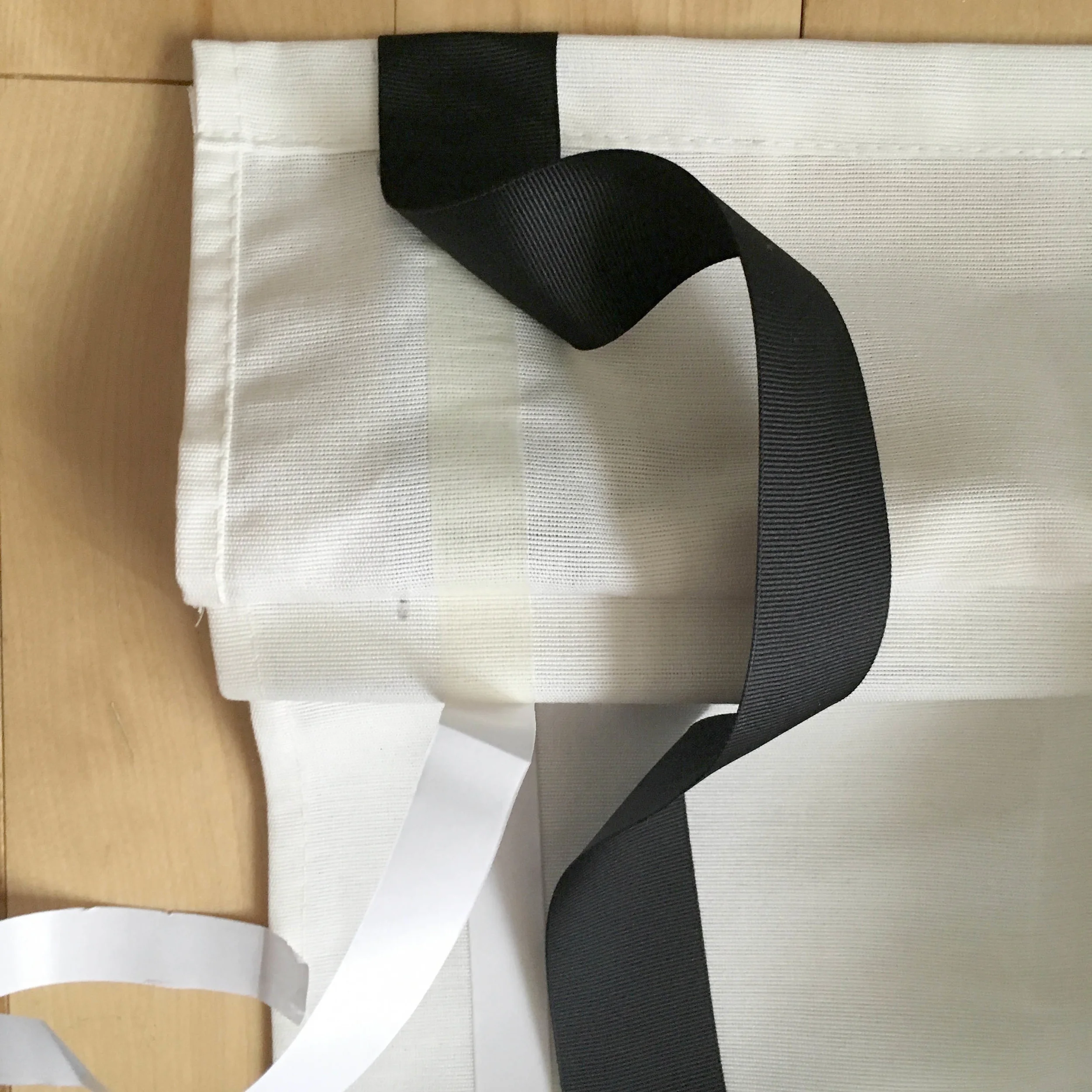
Now the fun part! Use one of your Glue Dots to secure the top of the ribbon behind the velcro at the top of the flap. This will give you a clean finish rather than seeing a raw edge. Then just follow your tape line, removing the papery top coat of the tape and pressing the ribbon down as you go. Be sure you are keeping the outer edge of the ribbon lined up with your pencil marks. You can peel the ribbon back and re-adjust as needed, but try to minimize this as the tape becomes less sticky and can get bunched up. 

When you get to your first corner, unlike the tape, DO NOT CUT THE RIBBON! Bring the vertical stripe all the way down to the 1 1/2" mark on the bottom then fold the ribbon back up, creating a 45 degree angled line and keep going horizontally. Secure the small flap at the 45 corner angle with one or two Glue Dots. Repeat this process for the second corner. 

When you get to the spot where you ran out of double sided tape, just be sure to have your Glue Dots nearby and use them as needed to finish up the last few inches. Cut the ribbon to the appropriate length and secure under the velcro with a Glue Dot just like the opposite side. 

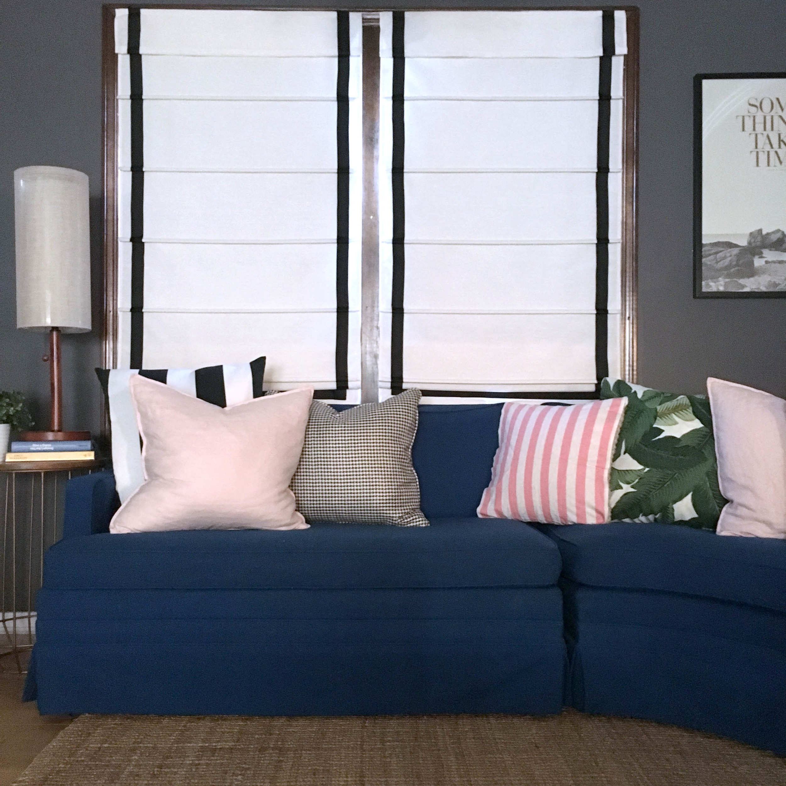
And that's all! Beautiful no-sew DIY black border roman shades. 

DIY Trim Border on Roman Shade

Styling Secrets and Quick Tips: Layered Rugs

Hi, guys! So I know layering rugs is not a new thing but in case you haven't had a chance to try it or maybe didn't realize it is such a great option for working within a budget or using vintage rugs that are often odd sizes, I thought I'd bring it up again. LAYERED RUGS ARE AWESOME!

  • If you're working with a larger space like a living or dining area, a room size rug can easily break the bank. Instead, try layering a less expensive sisal or jute rug under a smaller size of the kilim of your dreams.
  • Have some vintage rugs that you adore but find they are too odd of a size to fit anywhere? Layer one (or more!) over something cozy and neutral.
  • Mixing colors and patterns can instantly create a high-style feel. Typically I would suggest keeping one of the pieces a bit calmer, but if the rest of your style follows suite, don't be afraid to go bold!

Source |

| Source |

| Source |

| Source |

What did you think of this Styling Secrets and Quick Tips post? We're considering mixing these in more often and we'd love your feedback!

A Mid Century Coastal Inspired Living Room

My husband, Matt, and I just returned from a trip to California to celebrate our 5 year anniversary and I decided to put together a living room design board inspired by our trip. I've loved this kind of chic, relaxed-but-sophisticated west coast vibe for awhile now and this room is a nod to that. 

*sources for all items shown at bottom of post

Breaking it Down:

  • This custom, mid century inspired sofa is a truly versatile piece that could be used with many different looks and styles. When investing in a larger piece of furniture, it's important to consider whether it will still work if you decide to change up the the colors and accessories down the road. 
     
  • I really love how the woven blue plaid rug has a strong geometric pattern to match the clean lines of the rest of the design and how and the texture and color variations provide warmth and depth. The more casual feel of the this rug, along with the leather poufs used as additional seating, create a cozy, easy-to-live-in atmosphere. 
     
  • The interwoven walnut legs of the coffee table carry mid century sensibilities and the round glass top keeps the piece light and modern. The round top also echoes the form of the rattan chair and wall mirror creating balance and juxtaposition with the linear elements.
     
  • It's no secret that rattan is seeing a comeback and this swivel lounge chair is a handsome and unique take on the style. With a shape reminiscent of 70's furniture, the organic flow of the rattan, a polished chrome base, and a perfectly sophisticated black seat cushion, this piece is on trend without being predictable. 
     
  • Accessories really can make or break a room! It's important that they feel at home in a space without getting all matchy-matchy. Artwork and decor should feel collected even if you ordered it all online the same day.  I've carefully selected a few pieces that gently reinforce an overarching color palette, bring warmth and "story" to the room, and highlight a range of mediums and tones. 
     
  • This light fixture is a new favorite and I can't say enough good things about the scale and proportion. It is available in various stem lengths so be sure to consider your ceiling height when selecting the overall height. 

Please pin from these original image sources: 1 || 2 || 3 || 4 

Where to Use This Style: 

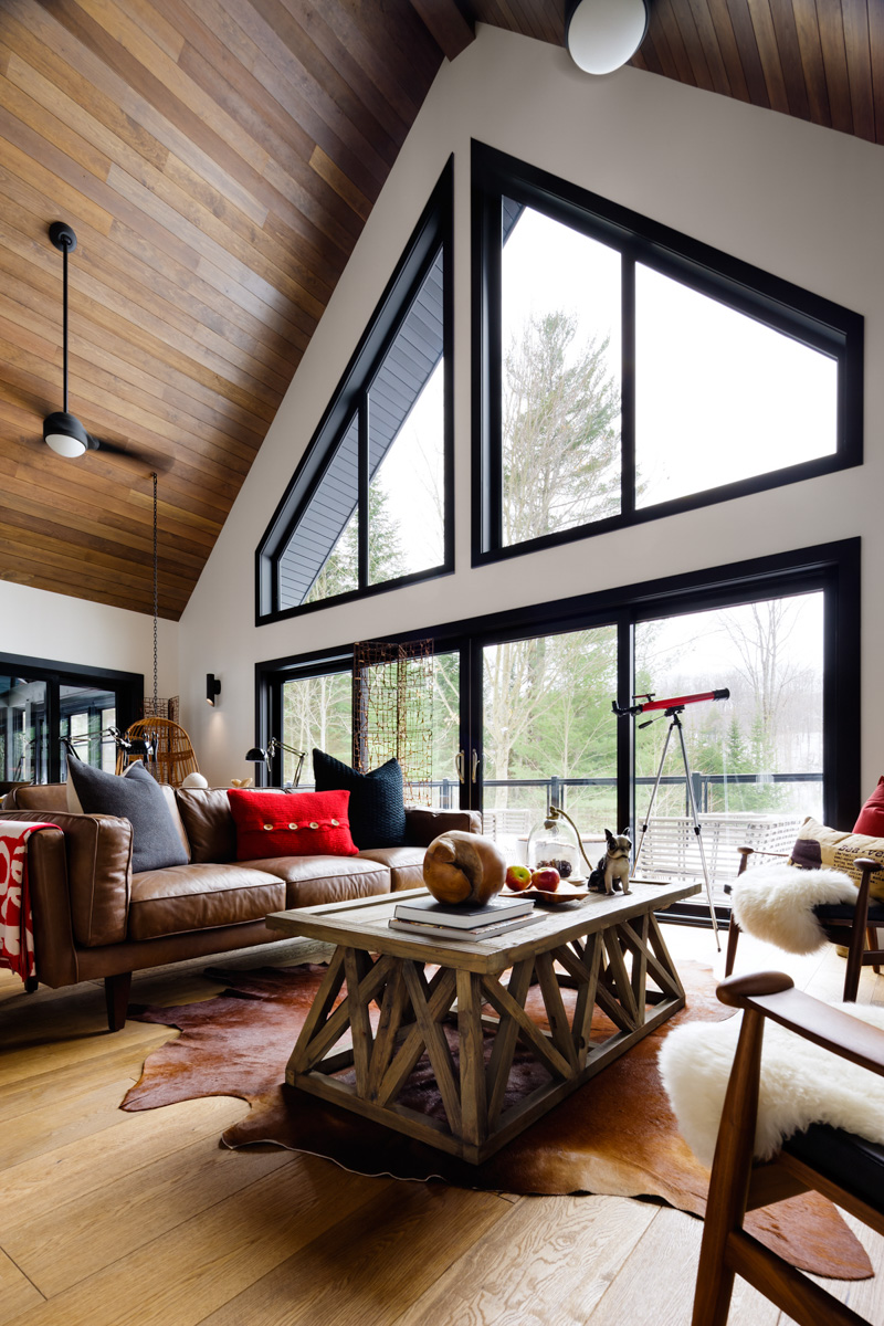
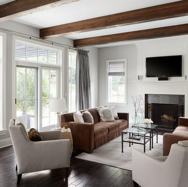
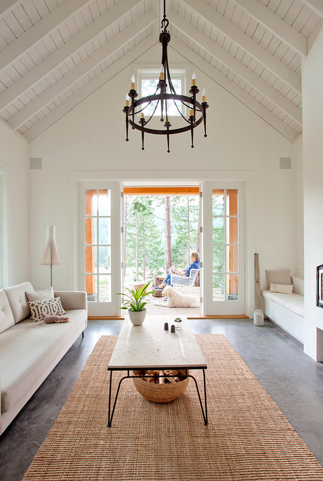
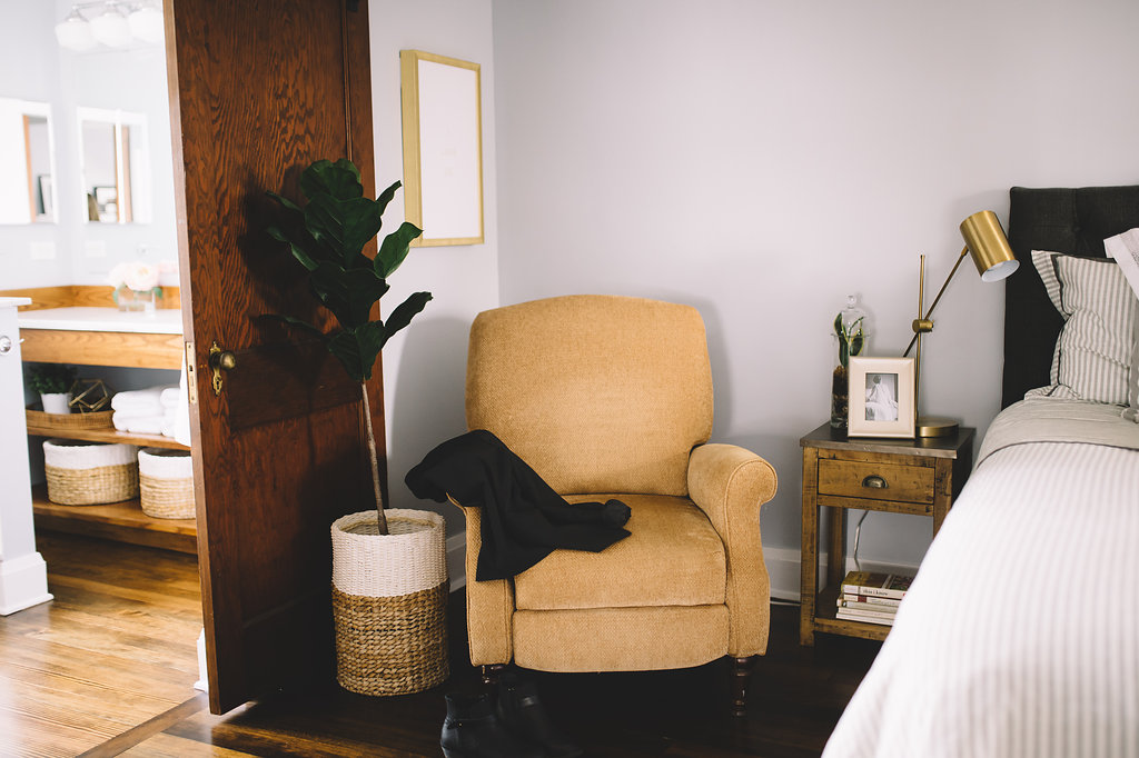
I also wanted to show the versatility of the collection so I rounded up images a few different types of interiors (picture the room itself, not the current furnishings) that each serve as a gorgeous backdrop for this look. Placed in a modern, rustic, traditional or eclectic setting, these pieces meld into the perfect blend of classic and interesting; I think they would look stunning in any of these four spaces. 


Master Bathroom Reveal

I can't even begin to tell you how excited I am to show you photos from this gorgeous master bath and bedroom! In case you missed the "before" pictures, you can find them here. WHAT A DIFFERENCE, right!? 

One of my favorite details is all the natural light. Using a glass shower enclosure and half wall take full advantage of the light pouring through the window (don't worry, it's privacy glass!) and then the large mirror over the vanity reflects the light into every corner of the room and overall makes the space appear larger. Orienting the sliding doors in front of the window means that when they are open the sunshine can spill right into the bedroom too.

Speaking of those doors, they are another favorite! The clients indicated that they would really like to use the doors that had been removed in the demolition phase when two bedrooms became one open loft. I'm always a fan of recycling materials so naturally I loved this idea and we made sure to size the new openings accordingly. As an added bonus, these doors are original to the house so they really help to maintain the character and tie in the old and new construction seamlessly. 

Take a look at the finished space below and let us know what you think!

All photos by Rachel Liz Photography

We would love to help you make your space the home of your dreams! Check out our design services and let us know how we can help!

Summer Art

I recently picked up a few new pieces of art that have a decidedly summer feel to them, and while I plan to leave them up all year, they are making me especially happy paired with all the sunshine we've been enjoying. 

I love the trend toward using coastal inspired elements (in moderation!) and a few beach-y prints or paintings are the perfect way to incorporate that summer vacation feel without getting kitschy. Here is a round up of some of my faves! 

1 // 2 // 3 // 4 // 5 // 6 
7 // 8 // 9 // 10 // 11 // 12