Behind the Scenes Style: Colette Wright

I am so excited to introduce you to this lovely lady! Interior design blogger by day, labor and delivery nurse by night, not to mention being a wife and momma--Colette Wright over at Restyle It Wright may be fresh to the blogging scene, but she's taking it by storm! 

I absolutely adore her style, practical tips, and of course, our shared love of gold spray paint! As my wee one grows, she also should not be surprised if I flood her inbox with desperate pleas to spill her secrets for how she manages to do everything she does. (Don't say I didn't warn you!)

Keep reading for a behind-the-scenes answers about why Colette started blogging, her go-to sources, as well as a peek at her gorgeous, down-to-earth home!


Being a labor and delivery nurse and blogging about interior design seem like very different passions--what made you decide to start blogging?

Ha! Great questions. These two worlds couldn’t be any more different right? I’ve known since high school that I wanted to be a nurse and that was the career path I chose and pursued for 10 years. In nursing school I realized my passion for Labor and Delivery and fought hard to land my dream job and now here I am, welcoming babies to the world weekly!

When my husband and I bought our first house together in 2007 we were young and broke. We needed to make our family our 4 function in a 1300 sq ft space in a ‘work with what ya have’ way. This is when my creative juices started flowing and turned into my passion for home décor and DIY. Friends and family were excited with how our projects turned out and started asking me for help with their own spaces. This is when I realized I had something to offer the ‘ol interwebs and decided to create a space to share our tips, tricks, and inspiration.

Ikea Coffee Table // Restyle It Wright // Blogger Interview

What is your favorite room in your new home?

My favorite room currently is our living room because it’s the most complete. I love everything about it from the handmade console table behind the couch, the Ikea hacked coffee table, and our oversized perfect-for-cuddling couch. Once the front (formal) living room is complete I suspect it will be new favorite room. I love the natural light pouring in from that room along with the vaulted ceilings.

What space in your last home were you the most sad to leave behind?

Oh don’t make me cry Sarah! I miss everything about that home and the memories created there. I’m a sentimental sap. The space I most miss has to be our living room. It’s where we spent the most time as a family. The view from the picture window was home to my favorite tree, a flowering crabapple that looked gorgeous in the Spring.

Crab Apple Tree // Restyle It Wright // Interior Design Blog Interview

You mentioned loving gold, do you have a favorite gold spray paint project?

Boy do I! I keep a stash of about 5 cans of gold spray on hand at all times, you know, just in case the mood strikes me.  I didn’t do a post about it (pre-blogging), but you can see the Ikea Vittsjo shelves in my daughter’s current room were spray painted gold. I also love to spray paint furniture knobs and picture frames for an instant glam effect. My next spray paint project will be some furniture feet for our bedside nightstand. That will be a post for sure!

Who are three of your favorite design bloggers?

So many great ones to choose from! My all-time favorite blogger is Jennifer Jones from I Heart Organizing. I love her style and organization tips. She also has amazing photography skills!

John and Sherry Petersik from Young House Love are another favorite of mine. I love their sense of humor and no-nonsense approach to decorating. They mix thrift finds, DIY, and splurge pieces to really make a room look polished.

Another great décor blogger I love is Cassie from Hi Sugarplum! Her bedroom is swoooon worthy. She makes bold color decisions that would intimidate the heck out of me but she makes them work beautifully. I admire her decorating courage and eclectic style.

Where are three of your favorite places to shop for home goods?

It’s no secret I love Ikea. The price and versatility of their pieces can’t be beat. It’s rare I buy something from there and leave it alone…I just can’t help myself!

Home Goods and TJ Maxx are great places to look for décor accessories for bookshelf styling and the like. They also have great prices on baskets and bins.

West Elm and Anthropologie tie in my book.  I love the modern style of West Elm and the bohemian style of Anthropologie. Those are two places I will save my pennies and splurge! My anthro curtains in my bedroom are heavenly and I love my West Elm duvet. I stalk those places like crazy for sales and then swoop in!

Master Bedroom // Anthropologie Curtains // Blue and Gold // Restyle It Wright

What current design trend are you loving?

I’m currently loving a mix of metals and wood with pops of color and white.  I love the glam of the metal and the rustic nature of the wood. The pops of color bring it all together for a chic style I absolutely adore.

How would you describe your design style?

This is a tough one! I’ve often asked myself this very question. It’s sometimes easier for me to identify with what I’m not. I know my style isn’t country or farmhouse and isn’t all together modern or bohemian.  I would describe my style as glam and chic. Bright pops of color, light walls, black and white accents, a mix of metals, and a touch of rustic are all my jam.

When you aren't working or blogging, what are your favorite activities?

Between the two there is hardly free time it seems! I love going to support my kids in their sporting events and musical competitions.

I also love thrifting and working on projects around the house. Finding that diamond in the rough and fixing it up to give it new life is so rewarding.

Finally, spending quality time with good food, family, and friends is what life is really about and I enjoy every second of doing that.

What is your biggest source of inspiration?

My biggest inspiration are all the beautiful blogs I read daily like yours Sarah! I love seeing photographs of how others decorate their spaces. It inspires to look at my own space in a new way!

I also find inspiration in home décor books and magazines like Domino and HGTV.


You can see more of Colette's home projects, chic design sense, and warm personality by following her on Pinterest, Instagram, Facebook or Twitter

Pillow Fort: a New Option for Styling an Affordable Kid's Bedroom

Today Target released a new line of home goods geared towards children. First, let's all acknowledge how adorable the name is--Pillow Fort--I mean, could it get any cuter? And a cute name isn't all it has going for it; this stuff is the bees knees! With both modern and traditionally inclined pieces, you could pull off a Pottery Barn Kids/Land of Nod look (for a fraction of the price) or go for a more Ikea meets Urban Outfitters vibe. Different collections feel better suited for different ages, ranging from nursery design to pieces even young teens would love. 

I rounded up a few of my favorites into two mini design boards. All items pictured are from Target, and most are from the Pillow Fort line itself. 

Boy's Room: Outdoor Adventure

Sources: 

Giraffe Head / Zebra HeadBear Head / Woodgrain Canvas Bin / Lamp / Tepee / Fox Pillow / "Hello" Sign / Black and White Bedding / Night Stand / Striped Rug / Wild and Free Sign / Green Paint - Benjamin Moore Absolute Green / Blue Paint - Benjamin Moore Morning Sky / Mural Inspiration


Girl's Room: Sunshine Chic

Sources:

Black Vinyl Adhesive Stripes / White Dresser / Yellow Chevron Curtains / Unicorn Head / Mint Junior Cafe Chairs / Flower Pillow / Flamingo Sheets / Hello Sunshine Pillow / Night Stand / Lemon Comforter Set / Pink Spindle Floor Lamp / Mint House Cubby / White Basket / Fabulous Wall Art / Pink Paint - Benjamin Moore Melted Ice Cream / Yellow Paint - Benjamin Moore Sundance

**At this time, many of the items are only available online, but there is currently a 10% discount on most of the Pillow Fort line (as well lot's of other Home Goods!!) with coupon code: HOMESAVE10. If you spend $125 or more you save 15% but this cannot be combined with the above promo code. 


If you need help planning, designing, and sourcing items for your nursery or kid's room, we'd love to chat! We offer a variety of In-Person services, and our E-Design options are a convenient way to access custom design solutions no matter where you are located. 

DIY Agate Inspired Coasters

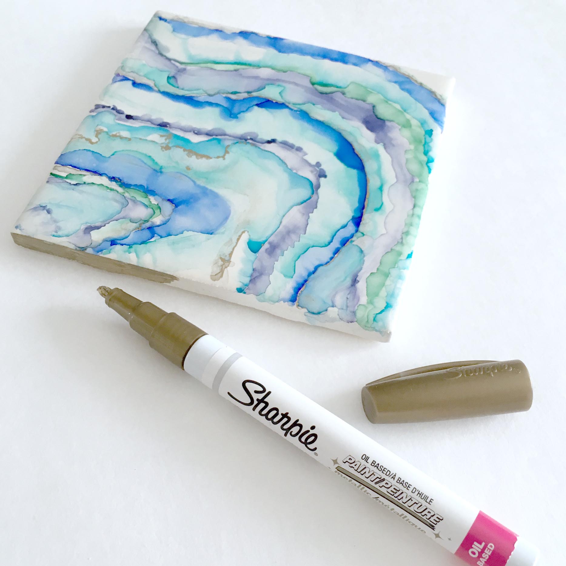
Agate is having a moment in the spotlight and I couldn't be happier. The colors, pattern, and texture have such an organic, fluid feel. I've had my eye on some agate art but haven't been able to think of the perfect place for it. This DIY project was just what I needed to fill the gap. Making these coasters was so much fun! It is easy, doesn't take too long, you probably already have the materials around the house, and the results are beautiful!

DIY Agate Inspired Coasters // Sharpie Art // Geode

Supplies Needed:

  • White Square Glazed Tiles ( mine were 4.25" x 4.25" ) 
  • Colored Sharpie Markers
  • Rubbing Alchohol
  • Paper Towels
  • Paint Brushes
  • Gold OIL BASED Sharpie
  • Clear Glaze
DIY Agate Inspired Coasters // Sharpie Art

Before you start working on a tile, it is helpful to decide what the color palette is going to be. I like to select a fairly monochrome set of colors for each tile. Don't hesitate to use a color on more than one tile, however. In fact, this will help to unify the set as a whole. 

Creating the Agate Effect

  • Start by drawing a curved line across the face of the tile. I think the balance of the pattern is better if you avoid starting directly in a corner.
     
  • Dip your brush in the rubbing alcohol and then push/smear toward the line you drew. This step takes some experimentation but if you make a mistake, just dip a paper towel in rubbing alcohol and wipe it away.
     
  • Repeat the first two steps, being sure to dab your brush dry often. 
     
  • Another useful technique is to tilt the tile after you have applied some rubbing alcohol. The rubbing alcohol pushes the ink and you can get pretty creative tilting and rotating the tile.
DIY Agate Inspired Coasters // GIF
DIY Agate Inspired Coasters // Sharpie Art
DIY Agate Inspired Coasters // Sharpie Art // Geode

Gold Veining

Use the gold, oil base Sharpie throughout your pattern to create this incredible veining effect! The oil base reacts a little differently to the rubbing alcohol, and almost clings to the sides of the adjacent colors. Seriously, how amazing are those gold edges!?  

DIY Agate Inspired Coasters // Gold Veining // Gold Oil Sharpie

Gilded Edges

Once you are happy with the pattern on the surface of your tile, use the gold Sharpie to color the edges of each tile. I recommend doing two sides, waiting a few minutes for those to dry, and then finishing the last two. It is also important to be careful not to touch the top of the tile as your fingers will smudge the pattern.

DIY Agate Inspired Coaster // Sharpie Art // Geode

Seal the Tile

The next step is to seal the whole tile with a clear coat. This will both protect the beautiful artwork you just created, and seal out any potential moisture when being used as a coaster. I am disappointed that the gold veining and edges lose a little bit of their luster when the clear coat is applied, but I have not found an effective alternative. If you find a better product or method, please let me know!

Do not worry if the surface of the tile appears cloudy as you are spraying the sealant--it will clear up as it dries. 

DIY Agate Inspired Coasters // Sharpie Art // Gold Oil Sharpie

Apply Backing

Lastly you will want to choose some sort of a backing for your tile. The purpose of the backing is to protect your tabletop from the scratchy, unfinished side of the tile. Felt is common choice, but personally, I don't think it does this project justice. High quality fabric in a coordinating print or solid would be lovely. I also think small adhesive tabs in the corners would work as well. They are usually made of plastic, rubber, or felt (and yes, felt would be okay in this application).

I actually haven't completed this last step yet because I am considering mounting the tiles inside a frame and hanging them as art. ( Like this

DIY Agate Inspired Coasters // Agate Art // Geode

Save this idea for later or share it with your friends by pinning it to your one of your Pinterest boards! You can also follow us on Pinterest to see more DIY projects and tutorials!

Our Name: an Origin Story

I've had quite a few people ask where the name "5 O'Clock Design Co" came from so I thought it would be fun to tell you a little bit of the meaning behind it and why we settled on it as the name for the business and blog. I'm also excited about the opportunity to show you a little bit of who we are and why we do what we do.

Naming a business is no easy task! It was important to us that the name had meaning and conveyed a sense of our values and design philosophy. It also needed to indicate what our business does while leaving us room to grow into future ambitions. Some designers, whose work I greatly admire, have gone the route of using their own name as their brand. I like this, but it didn't really tell the story I was hoping to.

We want to help you tell your story, not ours. 

Quote about going home // Home is where the best, and sweetest, and more real parts of the day happen

We really hope that you love your job and your co-workers--that if your profession requires you to put on real pants and walk outside your front door every morning, you are passionate about what you do and derive great pleasure and satisfaction from doing it. BUT, even if you are working in your dream career, we would bet that you still look forward to coming home each evening. 

Because we all know there is something special about coming home. 

Maybe children clamor for kisses when you walk in the door, maybe your furry friends are waiting by the window, perhaps dinner is already sizzling on the stove, or maybe your favorite chair is waiting with open arms--whatever welcomes you when you walk in the door, home is the place where you are loved and accepted for your truest self. 

We understand that not everyone starts work at 9am and heads home at 5pm, but even if you've never been caught in rush-hour traffic, we're sure you'll understand the metaphor. 5 O'Clock--the time you exhale whatever the rest of the day may have held and let yourself relax.

Quote about going home // At the end of the day, there's nothing quite like going home.

Your home should be your retreat, a place of rejuvenation and inspiration. When things are cluttered, chaotic, or just "not you" it's hard to get excited about spending time there. We love helping you identify how your home best suits you and how you can create a place you can't wait to come back to.

We design spaces that celebrate all the reasons you love coming home

A few ways we accomplish this are:

  • We really listen when you tell us what is important to you and then make sure the finished design reflects your priorities.
  • We set the desired mood and tone of your home by choosing appropriate colors, scaling furniture and accessories accordingly, and then layering just the right number of details.
  • We remain true to our design philosophy: People Matter Most.

Because we think having a place to call home (and really feeling like you fit there) is so important, we've also made it a part of your mission to give back to the community in ways that directly impact this idea. You can read more about how we do this on our community page

So there you have it--while there are no silly stories about scratching the business name on a cocktail napkin while sipping happy hour specials, (yes, someone asked that) we were pretty excited when the inspiration struck, and we're pretty proud of what it stands for. 


If you need help making your home your happy place, we'd love to chat!
We offer a variety of In-Person services, and our E-Design options are a convenient way to access custom design solutions no matter where you are located. 

Master Bathroom Build: Part 1

I am nearly bursting at the seams, that's how excited I am to be sharing this project with you! When some dear friends told me that they were going to add a bathroom to their loft bedroom, turning it into a bonafide master suite, I couldn't wait to get started on helping them design a beautiful, functional en suite.

Some of the requirements and priorities of the project included:

  • Separate toilet room
  • Large (ideally walk-in) shower
  • Vanity/makeup counter
  • Maximize natural light from window
  • Bench in shower (this got moved lower in the priority list as the project got underway, with the client opting for more square footage in the shower and a corner ledge instead) 
  • An open feel into the bedroom
  • There was also some plumbing that could not be moved and dictated a fixed point for the toilet

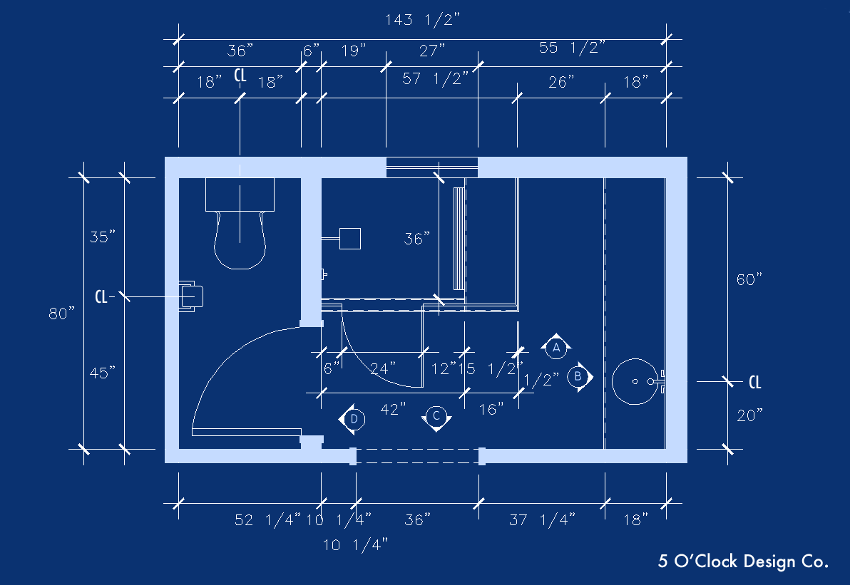
We started with a mood board for the space and a few iterations of floor plan layouts. Interestingly enough, the layout that the clients ultimately selected was not the one they were initially drawn to. I am so grateful they were open to suggestions outside of their comfort zone because the final configuration answers many of their must-haves in an elegant and efficient way.

Here is a BEFORE picture that the client sent at the start of the project. The blue tape line indicates where the wall between the bedroom and bathroom will be. In the final design we ended up stealing about 10 additional inches from the bedroom side. It was hardly noticeable in the bedroom but made a huge difference in the bath.

Master Bath Build Before Picture

The floor plan received a few more tweaks after this, but here is the working concept.

Master Bathroom Floor Plan

3D perspective images helped the clients visualize what the space would look like built out, as well as get a feeling for what the organization and flow would be.

Master Bath Sketchup Model
Master Bathroom Sketchup Model

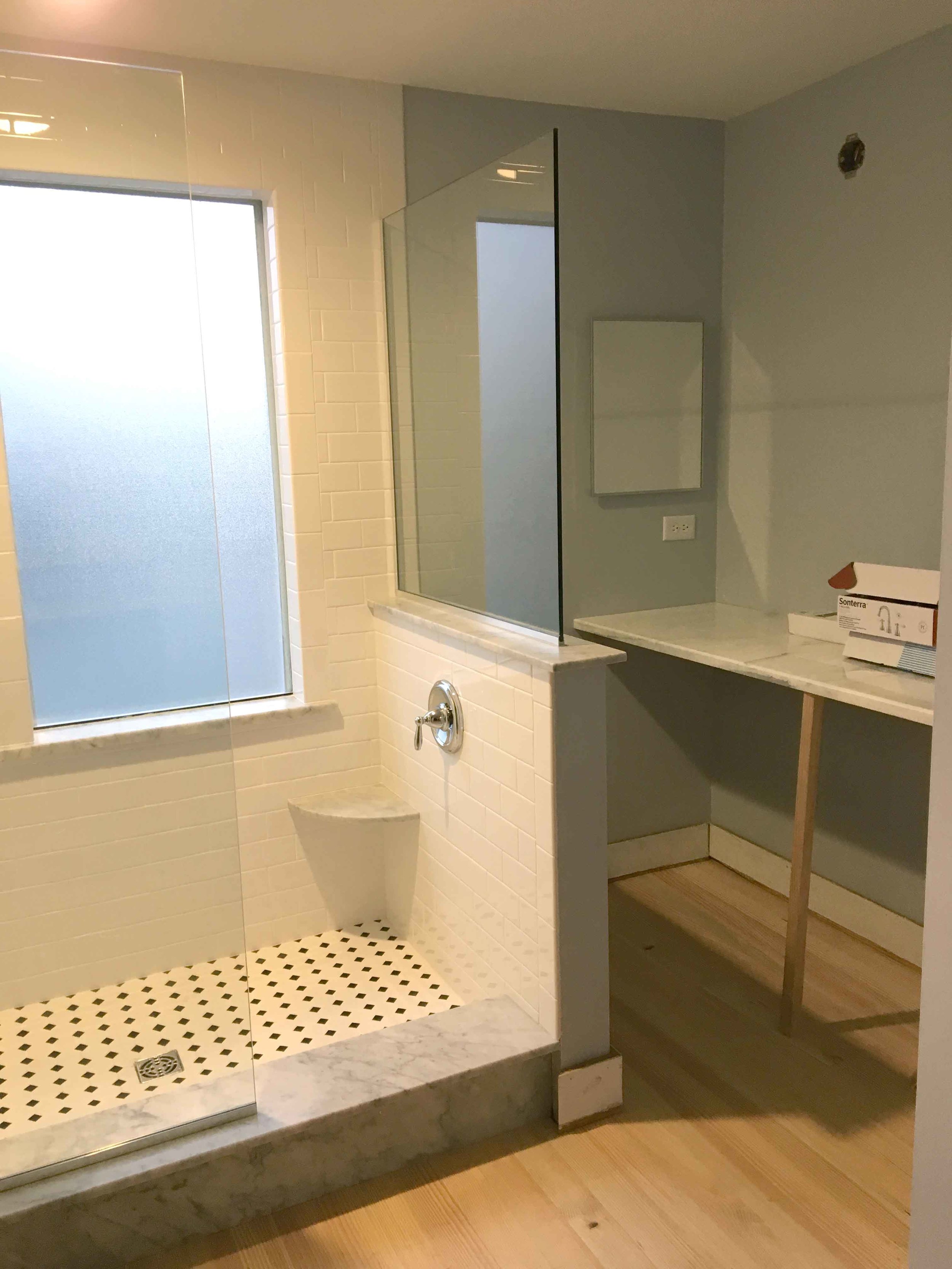
And finally, pencils down and hammers up! Here are a few pictures of the work in progress.

Master Bathroom // In Progress
Master Bathroom // White Subway Tile
Master Bathroom // Walk-In Shower // White Subway TIle

Want to see how it all came together? Check out the after pictures here!