Color Crush: Navy, Cobalt, and other Blues

It is no secret that I have a thing for the color blue. It seems to be taking over my closet and my Pinterest feed is saturated in it. Certain hues of blue seem to carry a truly timeless quality that can bridge many styles and work in lot's of different contexts and environments. But what makes a particular shade a classic? The key is to go for deep, rich hues or light, airy ones. Avoid those muddy middle tones that look like they belong in a living room from the early 90's. Here's a quick roundup of blue playing its A-game!

*If you like these pictures as much as I do and want to pin them to Pinterest, please be awesome and click on the source link then pin from their original sources. Thanks!

| Source

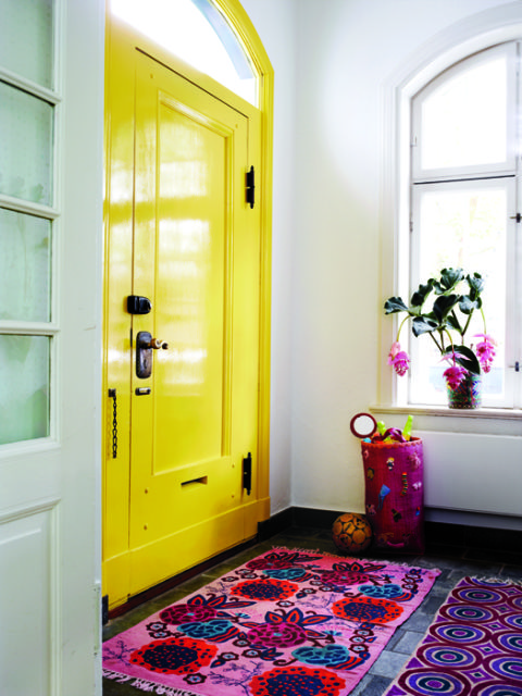
So not only is the front door a knock-out, look at that soft coastal blue of the siding peeking out on the left hand side of the picture! This what front door dreams are made of.

| Source |

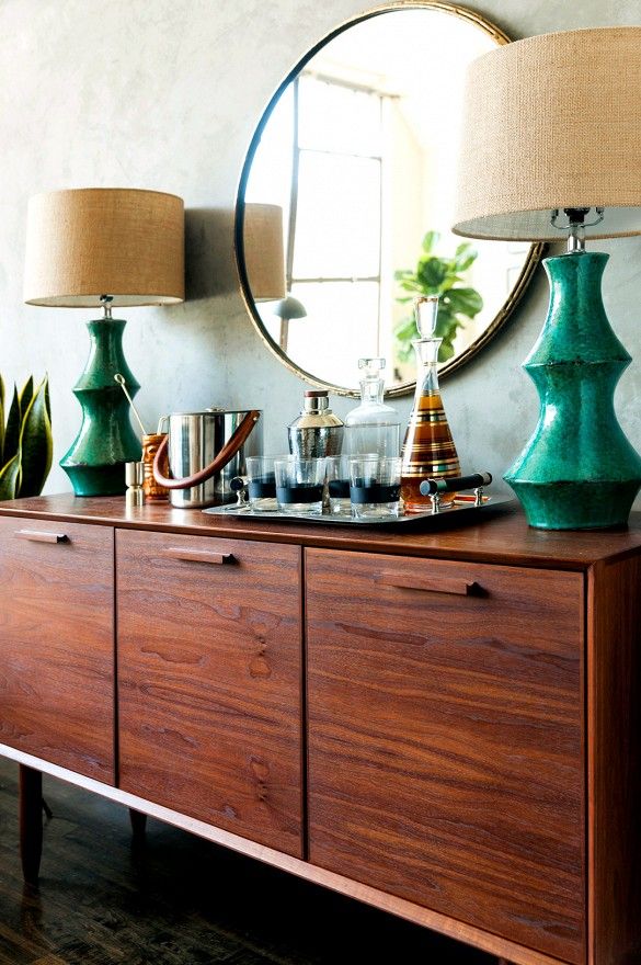
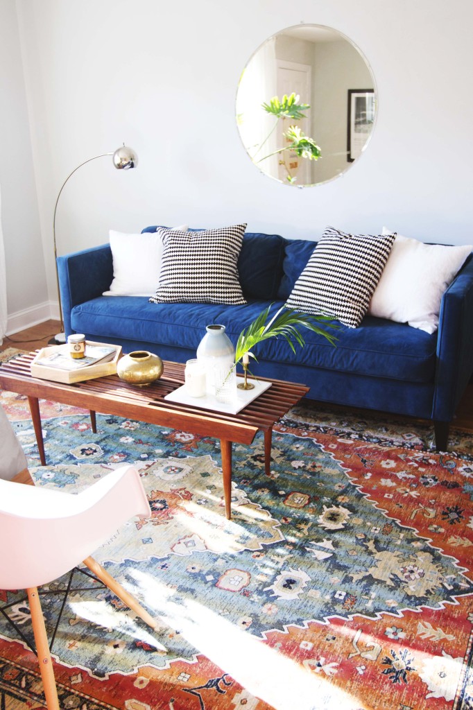
The blue velvet cushions are a touch of elegance in a simple room and the way light plays off velvet... alllll the heart eyes!

| Source |

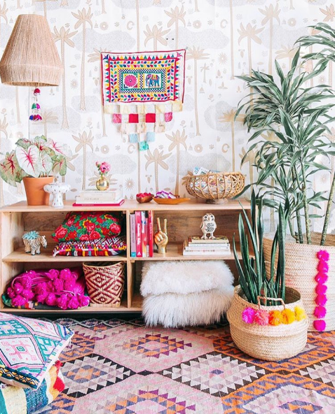
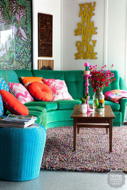
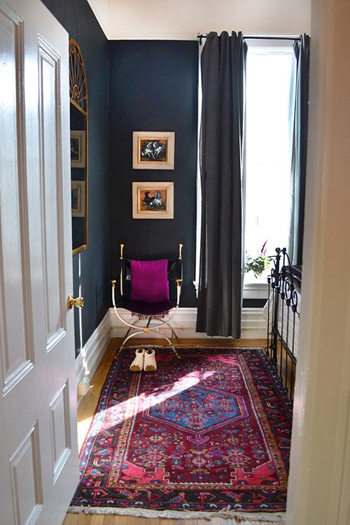
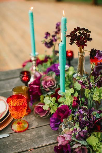
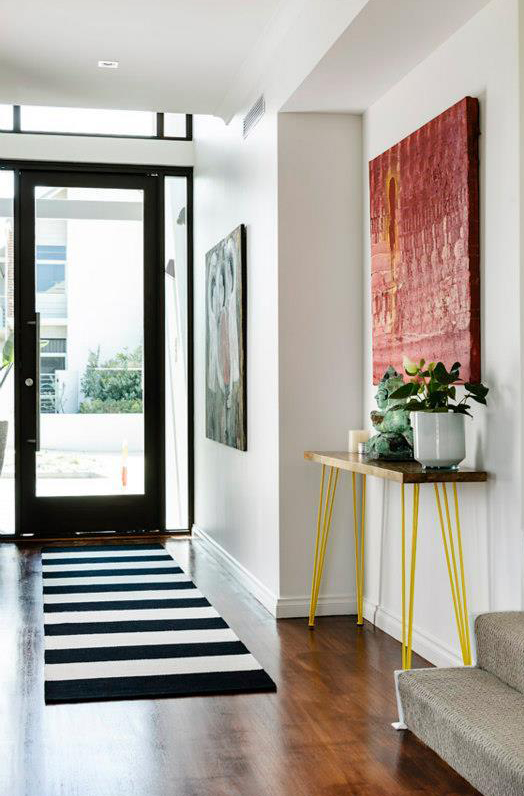
Blue, blush pink, red, black and white--this all comes together beautifully because the rug is the only strong pattern and it pulls colors from different elements. 

| Source

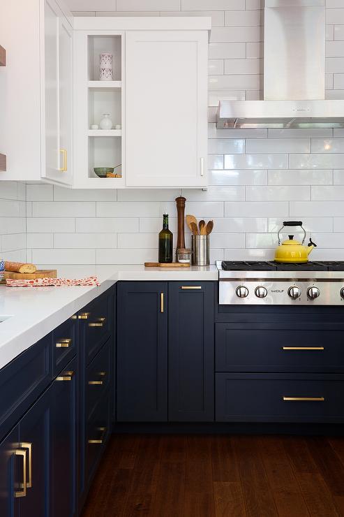
A navy so deep it's almost black contrasted with crisp white subway tile and upper cabinets is a win any day!

| Source |

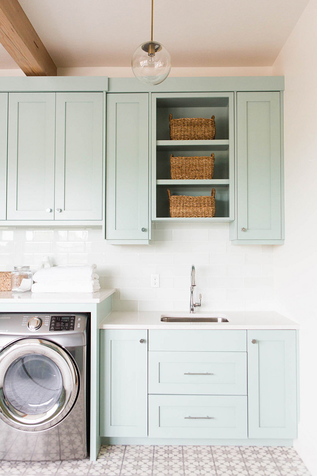
I could do my laundry all day in this laundry room! Heck, I could do OTHER people's laundry all day if I got to do it here. Seriously though--light, fresh, clean--perfect

| Source

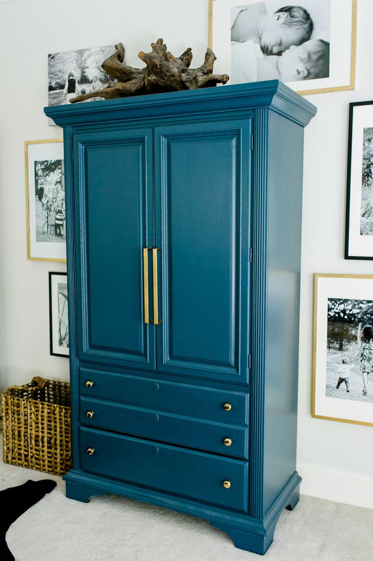
Did your mom ever tell you not to wear blue and black together? I'm sure she meant well, but it's time to break that rule! This glossy black dresser against this multi-blue wallpaper is both classic and fresh. 

| Source

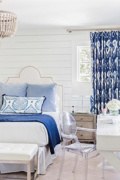
Mix some blue patterns with blue solids, add a bit of rustic wood and shiplap and you have a guest room your friends will fighting each other to visit. 

Bohemian Living Room Refresh

When Shauna sent me a note saying she needed help refreshing her living room, and that she loved the vintage bohemian vibe, I was super pumped for this project! She already had several pieces, both furniture and art, that she wanted to continue using, but was looking to freshen up the space and incorporate some pink. 

Inspirational Images

Before Pictures and the "Keep List"

From these "before" pictures, she wanted or needed to keep the following: 

  • Sofa
  • Coffee Table
  • Beige Chair and Ottoman
  • Art over Sofa
  • Black and White Syracuse Street Name Art
  • Blue and White Cabinet (open to painting)
  • Starburst Mirror
  • Vintage Rug (not shown in pictures)

The client also had a pink heart print she wanted to use and requested a silhouette of her puppy, Abe, be incorporated.  

Achieving Bohemian Style 

When trying to achieve an eclectic, bohemian feel the key is to layer things in a way that feels collected and accumulated but not cluttered. To accomplish this, quality and authenticity are incredibly important! While rattan and kilim patterns are en vogue right now, choosing vintage items rather than reproductions helps to establish a rich, storied environment. A few original paintings balance the pop art and adding plants is a must for any bohemian inspired room. 

When searching for vintage furniture, art, and accessories, Craigslist, Etsy, Chairish, and 1st Dibs are all great places to start.

The mood board we sent the client shows new and "new vintage" items mixed with the furniture and art from their "keep list". Rearranging, painting furniture, and some new textiles can go a long way in updating a room!

I can't wait to share pictures of the finished room once it all comes together, but for now, here are some links to shop this look for your own home!

Shop the Look

Color Crush: Jewel Tones

The last days of summer are slipping through our fingers and autumn is nearly here; what better way to bridge the gap between these two seasons than deep, rich, vibrant jewel tones?! I've rounded up some of my favorite uses of these gorgeous hues to inspire your end-of-summer creativity.

*If you like these pictures as much as I do and want to pin them to pinterest, please be awesome and click on the pictures then pin from the original sources. Thanks!

2. The deep, dark blue of these walls is warm, sultry, and mature. The bright pinks, blues, and reds of the rug provide a cheery, while sophisticated, vibe and the magenta throw pillow pulls it all together.

1. There's just something about a green velvet sofa that gets me ever time. Here it plays well with the myriad of other bright colors and is balanced perfectly by the green art and white walls. 


4. If you're still feeling a little shy about this color palate, try getting your feet wet by starting with a single piece of furniture. Pick your paint, add a little brass hardware, and voila! You're part of the awesome club! 

3. I know this post is about jewel tones, but let's talk for a minute about how nicely they pair with rich, warm, wood tones. These emerald lamps with this credenza are classy, elegant, and fun all at the same time. 

6. Jewel tones aren't just for your walls and furnishings, folks! This stunning table would be perfect for a summer/fall wedding or even a glamorous backyard picnic. I really appreciate that even the dishes play an active role in the color harmony happening here. 

5. I love how this furniture looks paired with the pastel blue wall. It is the perfect blend of warmth and lightness. Details such as the artwork, stained glass, and plants, reinforce the color palate and motif beautifully. 


So there you have it--wouldn't you agree that these colors kind of rock? I'm definitely feeling inspired to look for ways to incorporate more of these hues into my home! Comment below and share where your favorite places to use jewel tones are!


You Might Also Like These: 


Color Crush: Yellow

Hi, friends! With summer here in full swing, I wanted to highlight some of my favorite uses of the color yellow. It is such a warm, cheery color and it reminds me of sunshine, lemonade, and days at the beach. Yellow can be a tricky color to work with, but these folks nailed it! 

*If you like these pictures as much as I do and want to pin them to pinterest, please be awesome and click on the pictures then pin from the original sources. Thanks!

2. In this monochromatic kitchen, yellow chair cushions really pop! I especially like how the color adds visual weight to the ghost chairs.

1. The saturation and vibrance of this door are to DIE for. And I adore the use of hot pink as the complimentary color here. Go bold or go home!

4. This wallpaper is everything that wallpaper should be. It manages to pull off playful and fun while remaining sophisticated and elegant. 

3. I am in love with the idea of modern yellow on a vintage fireplace--what a statement! The yellow echoed in the floral rug brings unity and cohesion to the adjoining room.

6. Hairpin legs painted yellow are the perfect amount of color on this hall table and draw out the yellow in the painting above.

5. Here is another example of yellow chairs--in addition to looking divinely comfortable, they pair beautifully with the warm wood tones.