Silverware for a Fall Dinner Party

In case you haven't heard, over here at 5 O'Clock Design Co. we are pretty excited about the preparations for an awesome fall dinner party that's coming up! Last week we took vintage wooden napkin rings and gave them some pizazz, this week we are jazzing up some silverware to go with our theme. I have to thank my friend, Shauna, at Maeflowers Vintage for this fabulous idea. Shauna and I share a passion for mid century furniture, thrifting, and gold spray paint. When I saw her spray paint silverware (genius!) I fell in love with the result and knew I had to give it a try as well!

Gold Silverware for a Fall Dinner Party

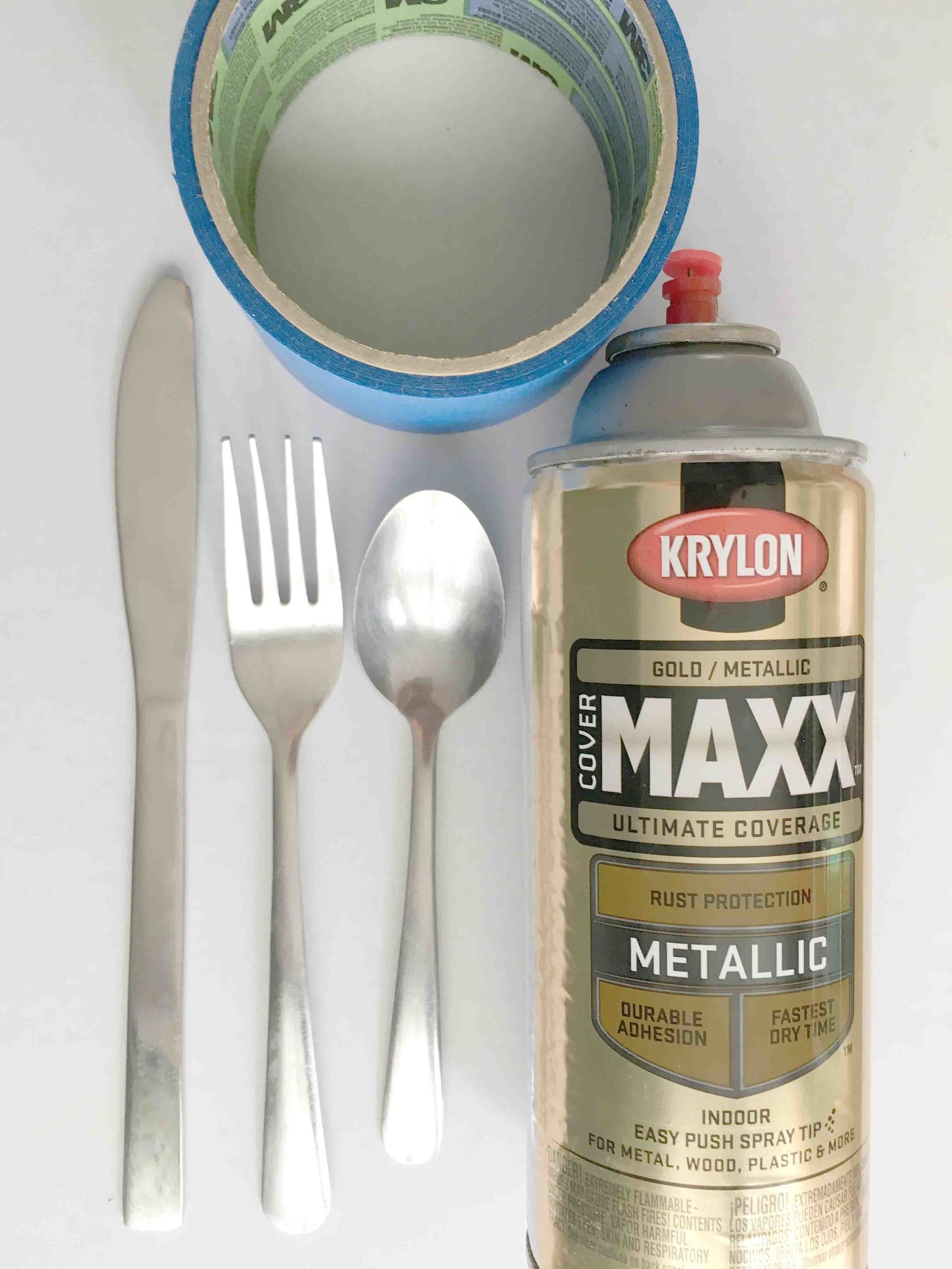
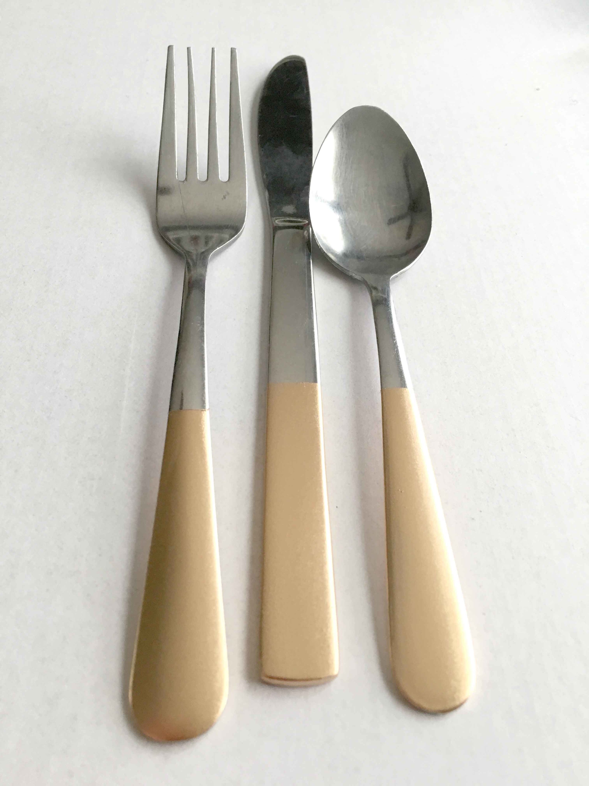
When my husband and I were planning our wedding, I was insistent that I wanted real silverware. Pricy rentals didn't fit the budget so I turned to our local restaurant supply store and ordered boxes of cheap, restaurant quality silverware. I have since dispensed of most of it, but I did hold on to a few dozen sets in case of big parties or company. I am so glad I did! I pulled out it out for this project and once it met a coating of gold spray paint, it's hardly recognizable!

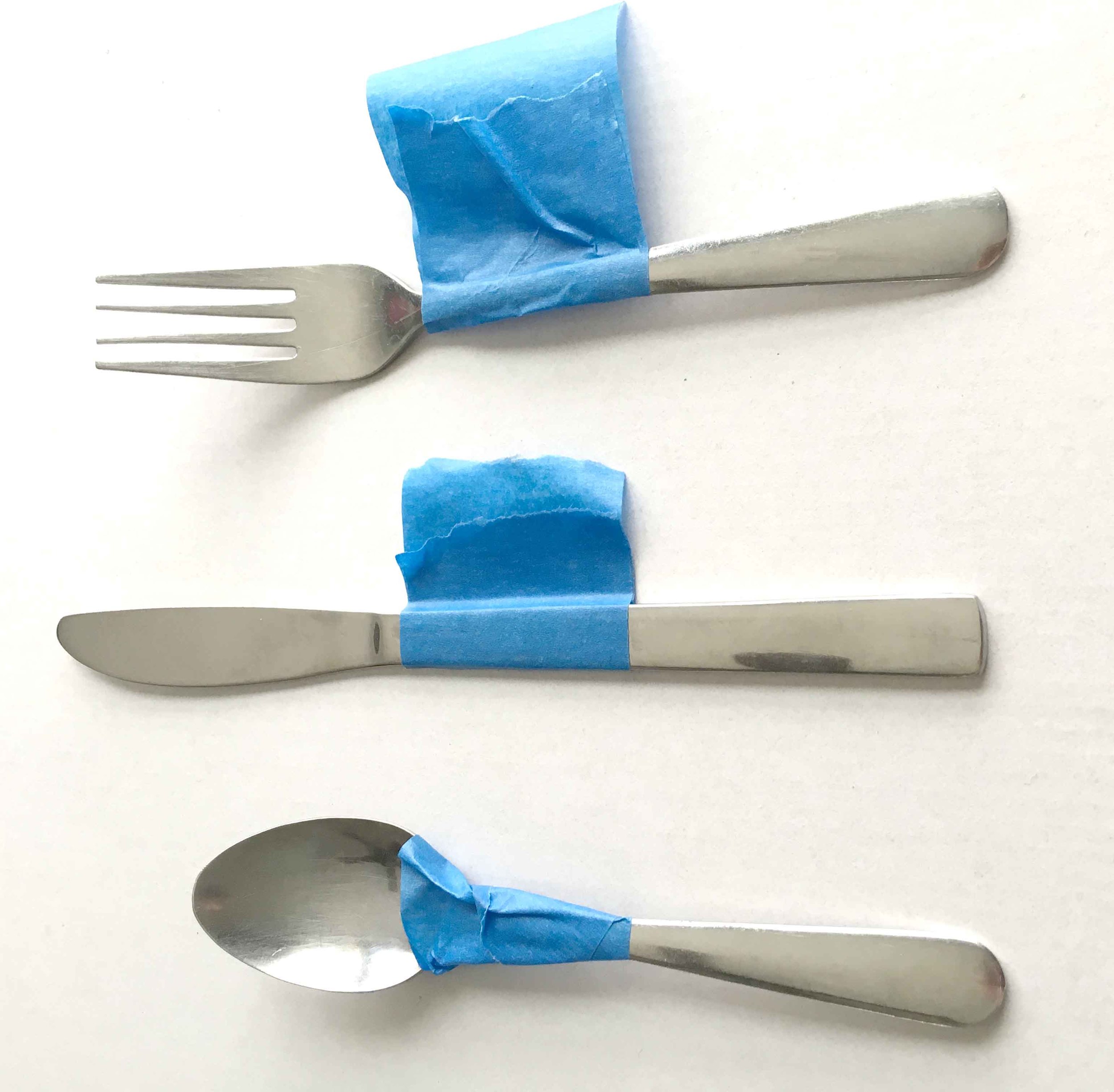
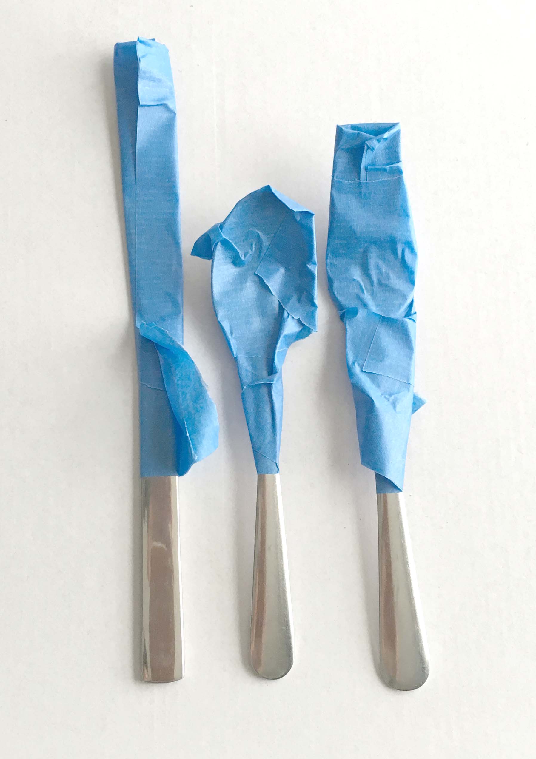
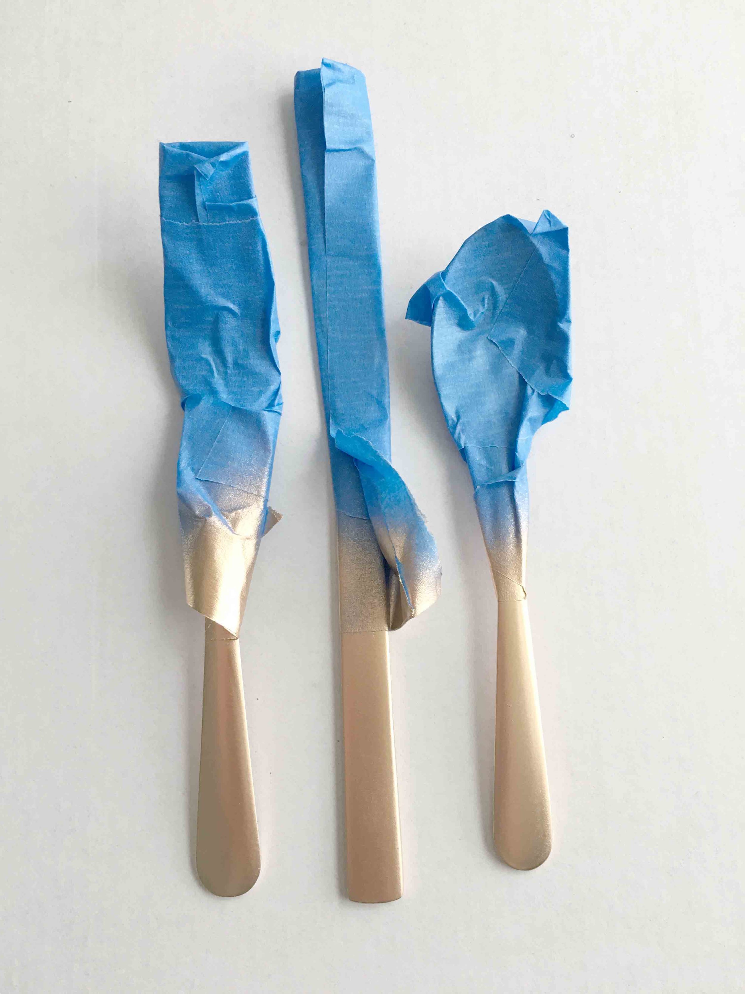
To start, I decided how far up the handle I wanted the gold to come. It was important to keep the paint away from the parts that would come in contact with someones mouth so I stayed well within the bottom two-thirds. First I taped a nice clean line where I wanted the paint to end, then I went back and covered anything else still exposed. A quick coat of what is quickly becoming my favorite gold spray paint, and tada--gorgeous silverware that is perfect for a fall dinner party!

Gold Silverware

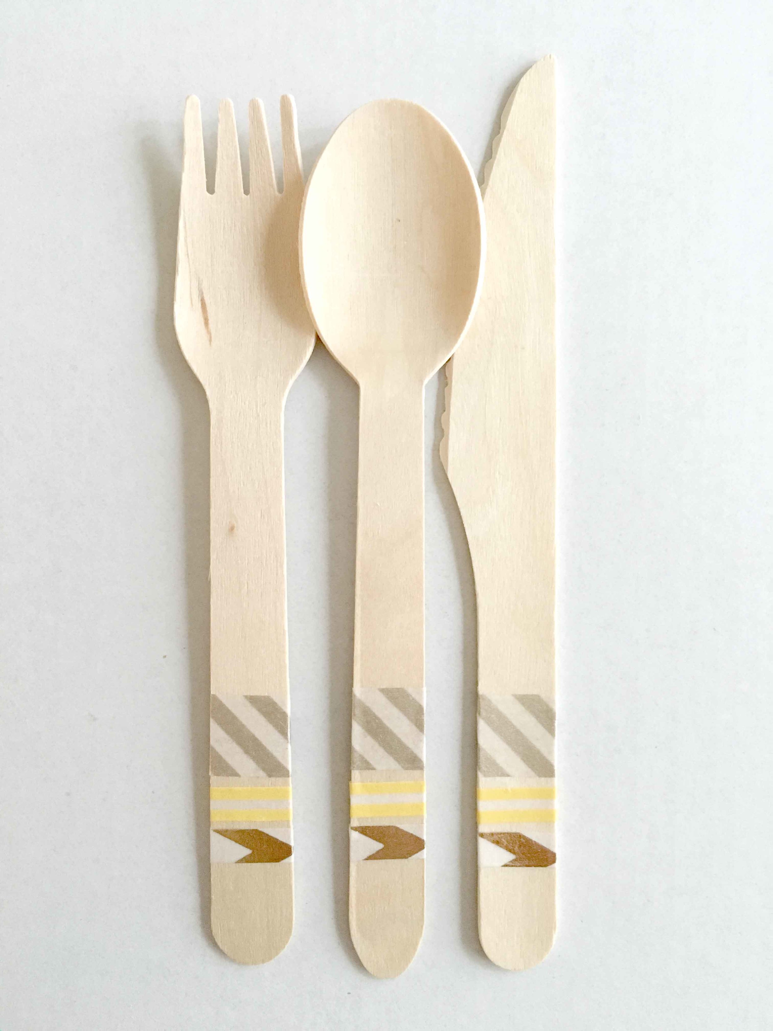
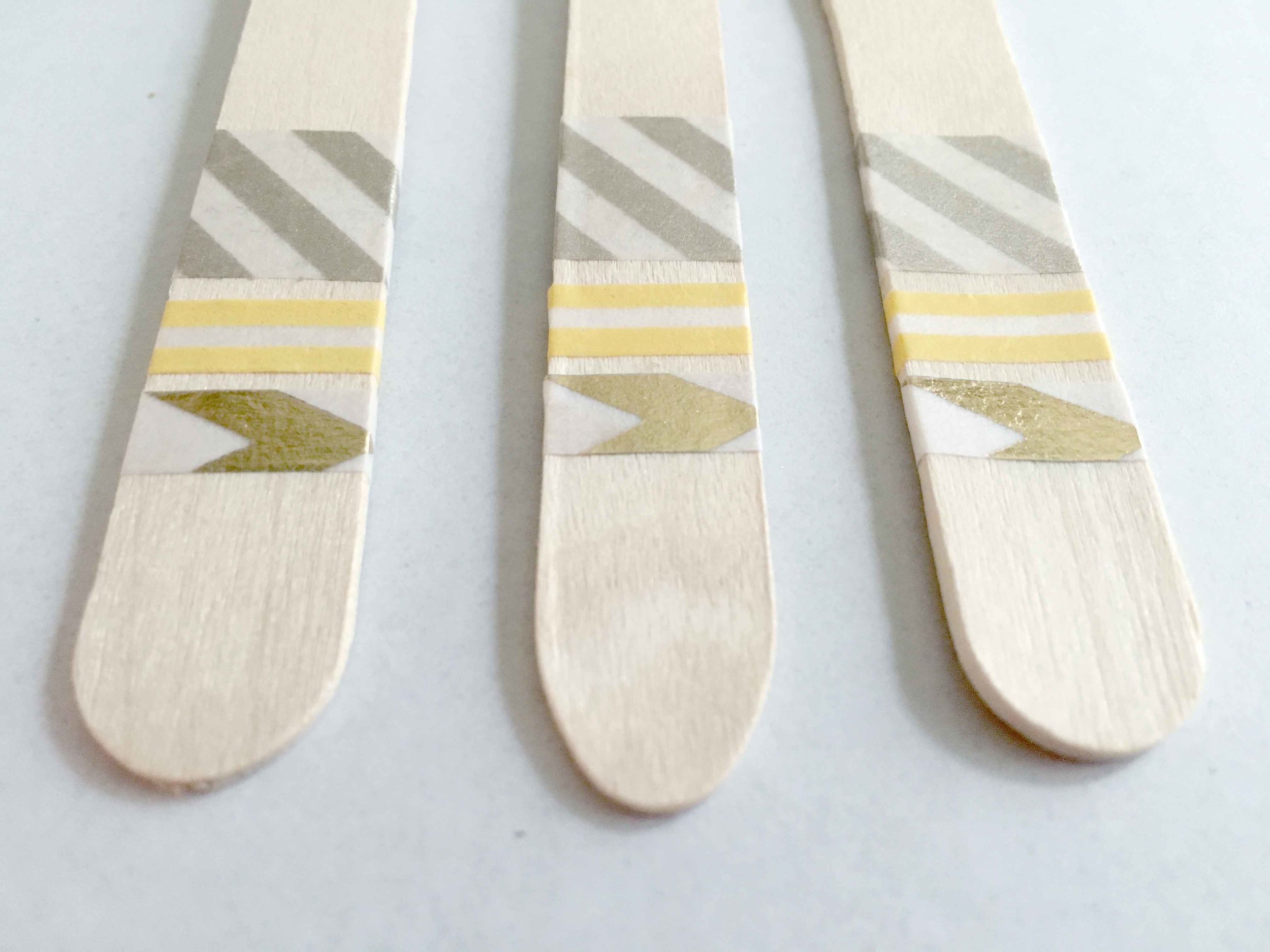
If you don't have two dozen sets of extra silverware sitting around, check your local dollar store or Christmas Tree Shops. I've had great luck buying decent, inexpensive silverware for projects at both of these places. Or, as an alternative, try this wooden silverware dressed up with washi tape! It's adorable, easy, and a little more informal. 

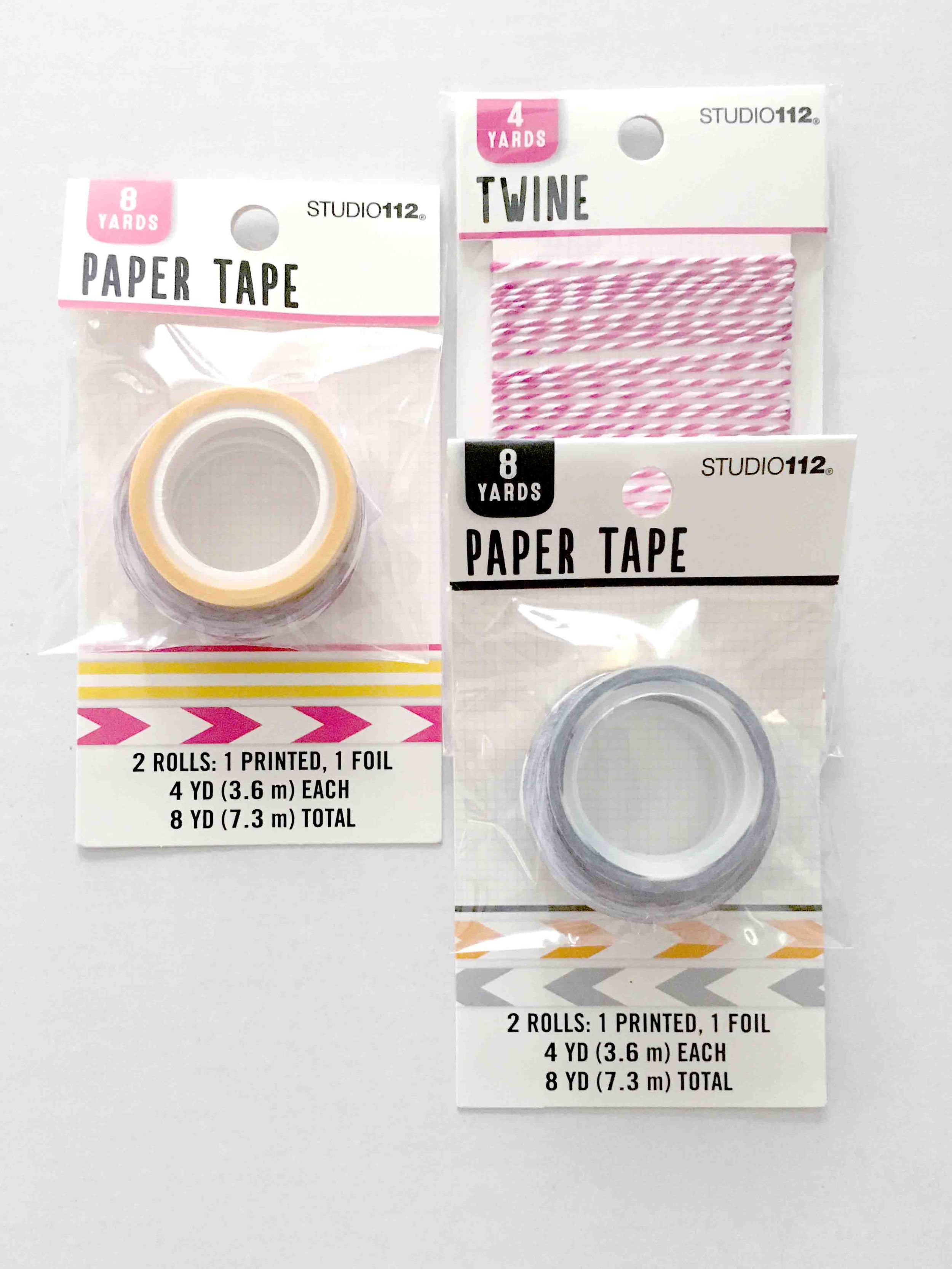
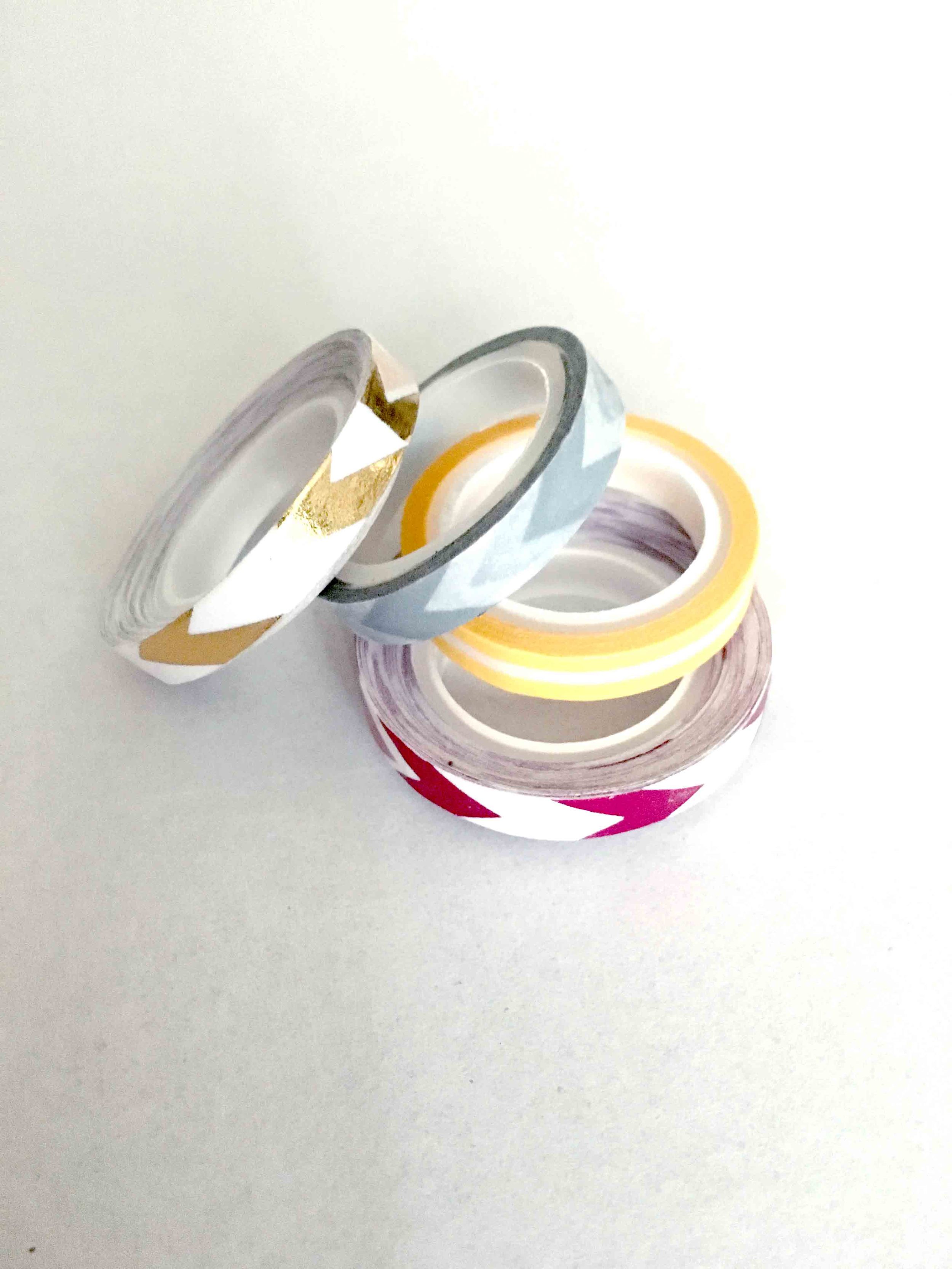
I bought my supplies at Joann Fabrics and, with coupons, got everything for less than $6. The wooden silverware came in a package of service for 6 and I picked up a few different styles of washi tape to experiment with.

Wooden Silverware and Washi Tape

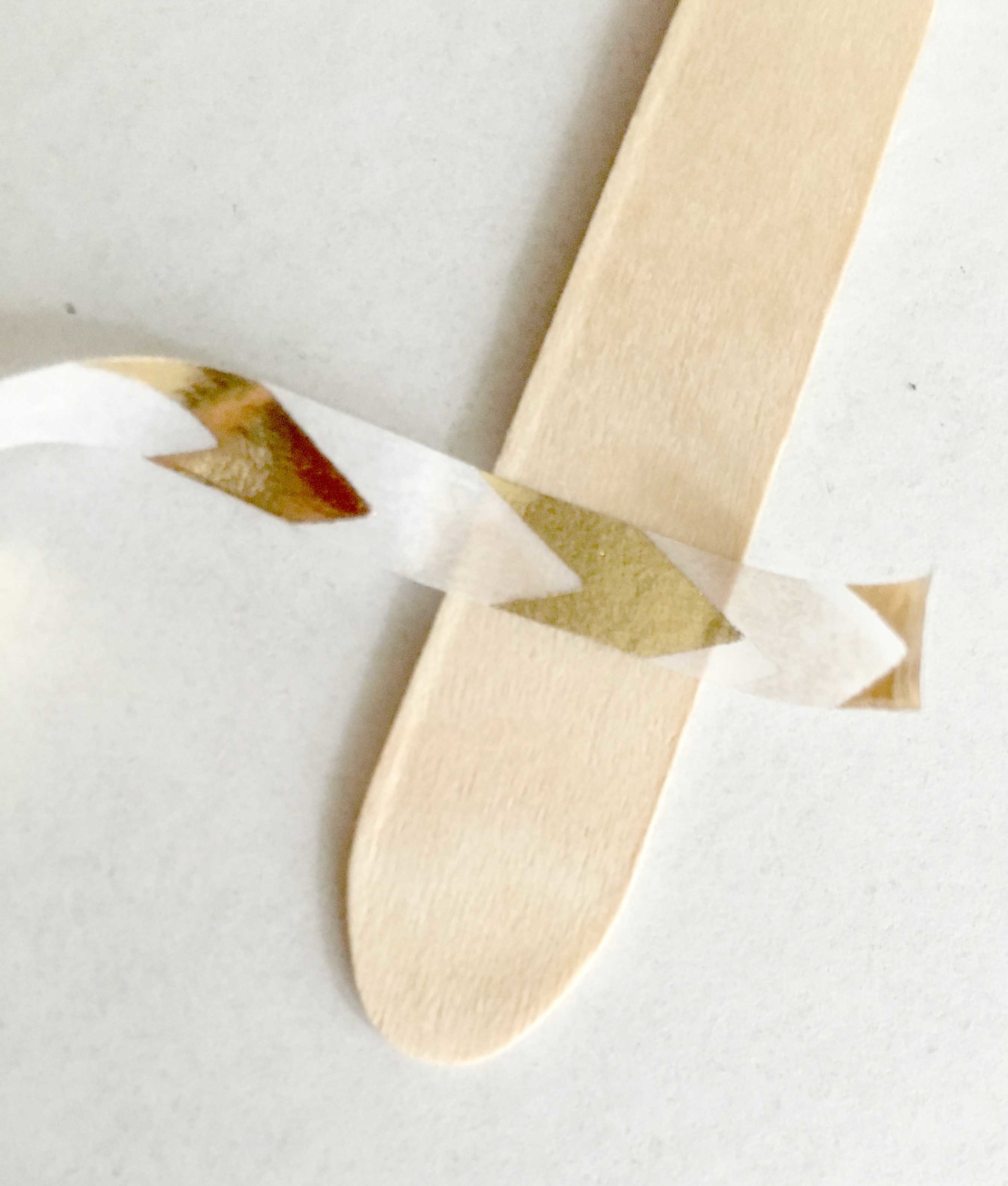
I played with placement of the designs for a few minutes, settled on a pattern I liked, taped the first piece, and then just repeated the pattern. This was soooo easy, not at all messy, and completely customizable depending on the washi tape you choose.

Wooden Silverware
Wooden Silverware

Whether more formal or casual, custom silverware is a total win for your dinner party! Which is your favorite? Comment below and vote!

Gold Silverware // Wooden Silverware // Fall Dinner Party

Fall Napkin Rings

A quick, easy, DIY project to get you in the fall mood! 

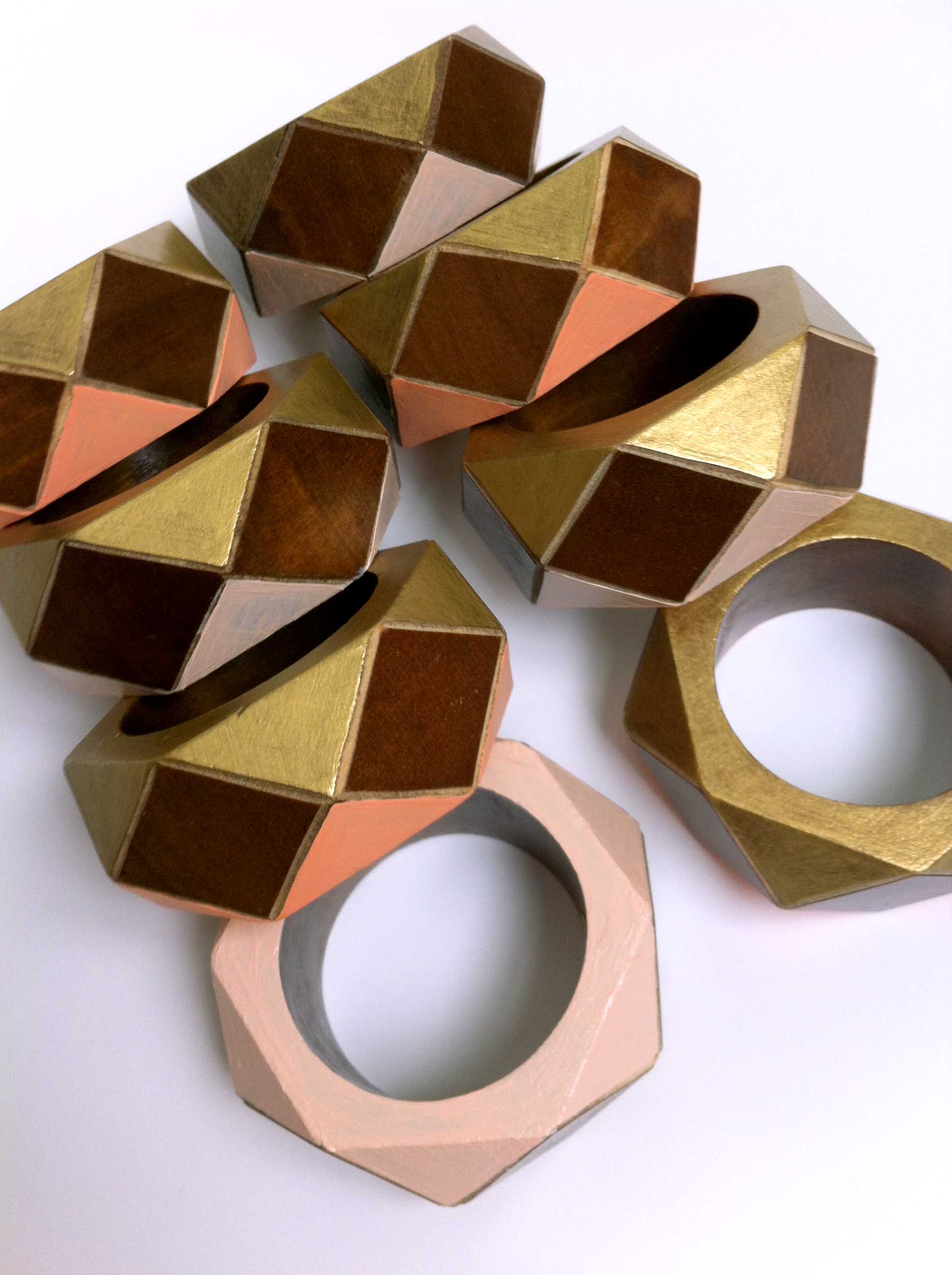
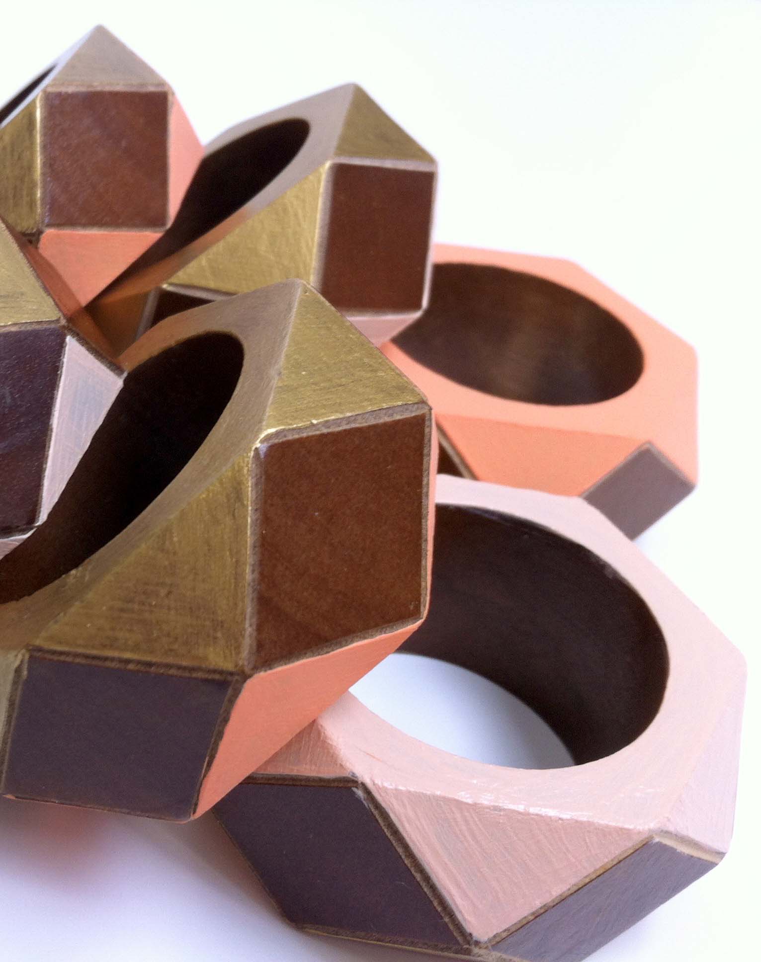
Wooden Napkin Rings for Fall

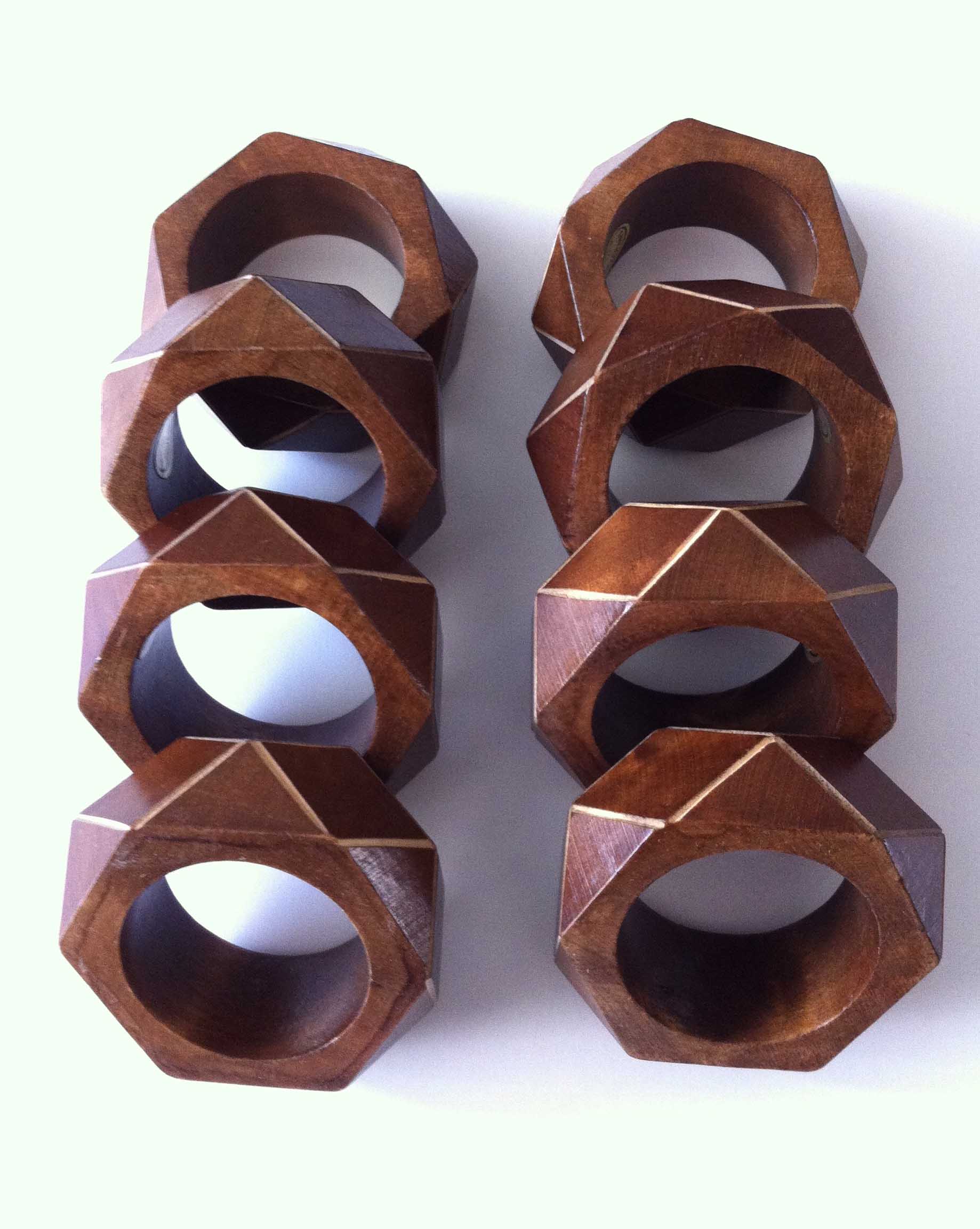
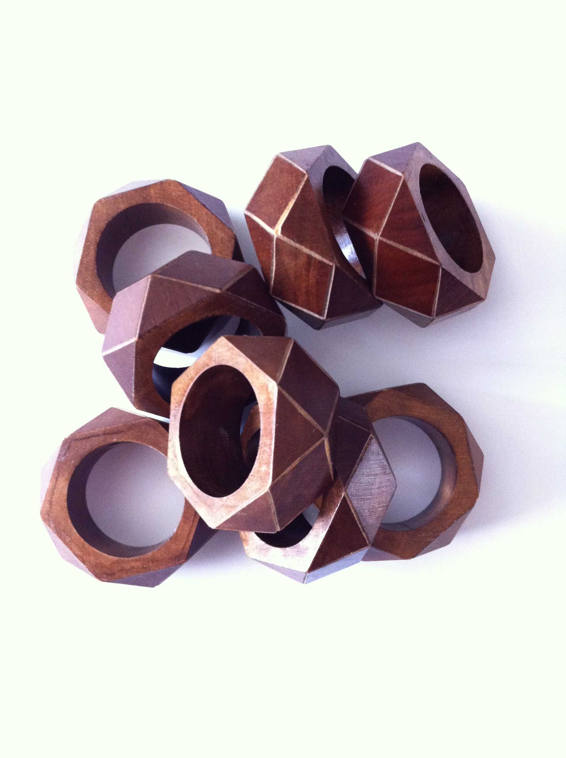
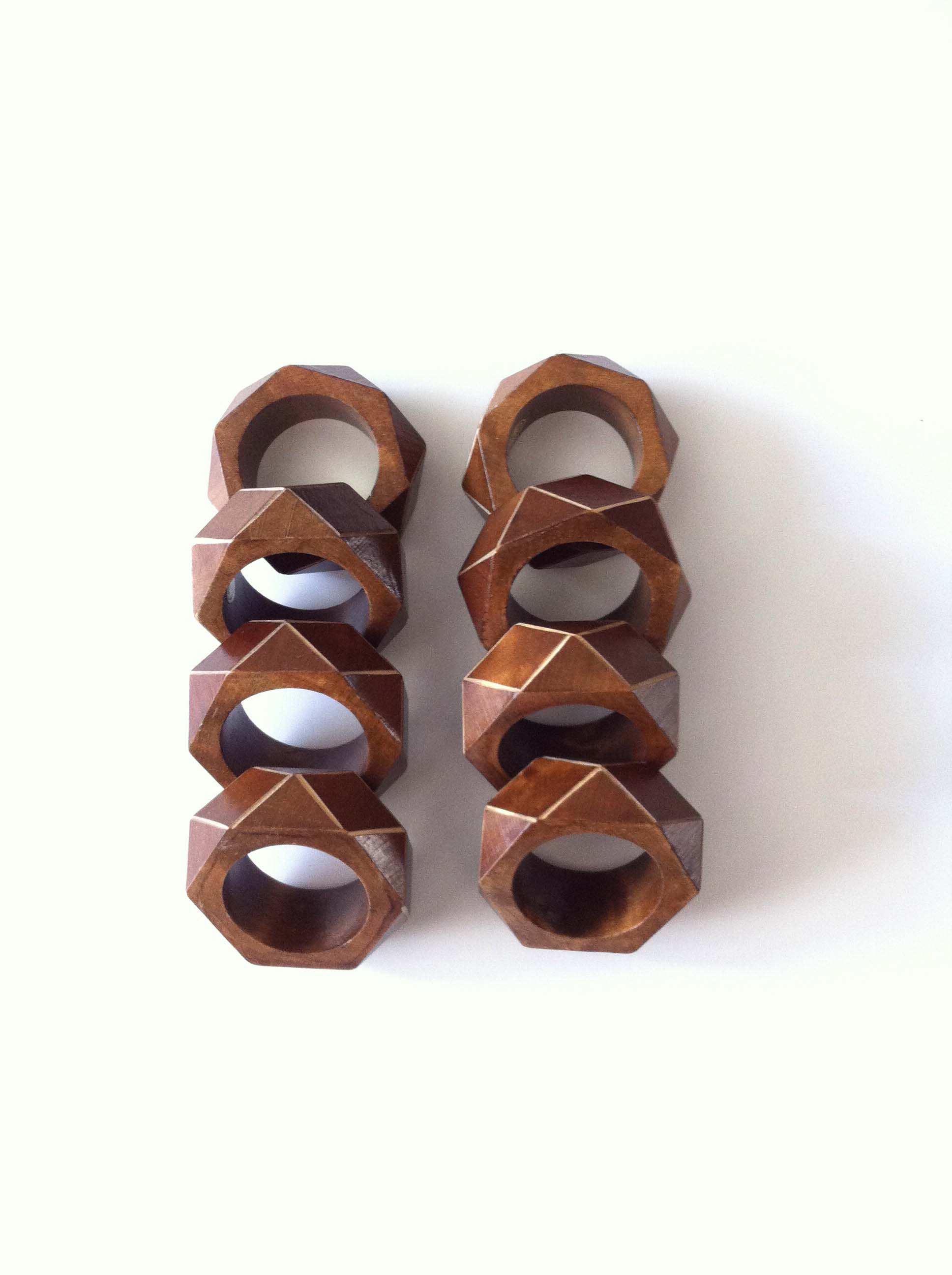
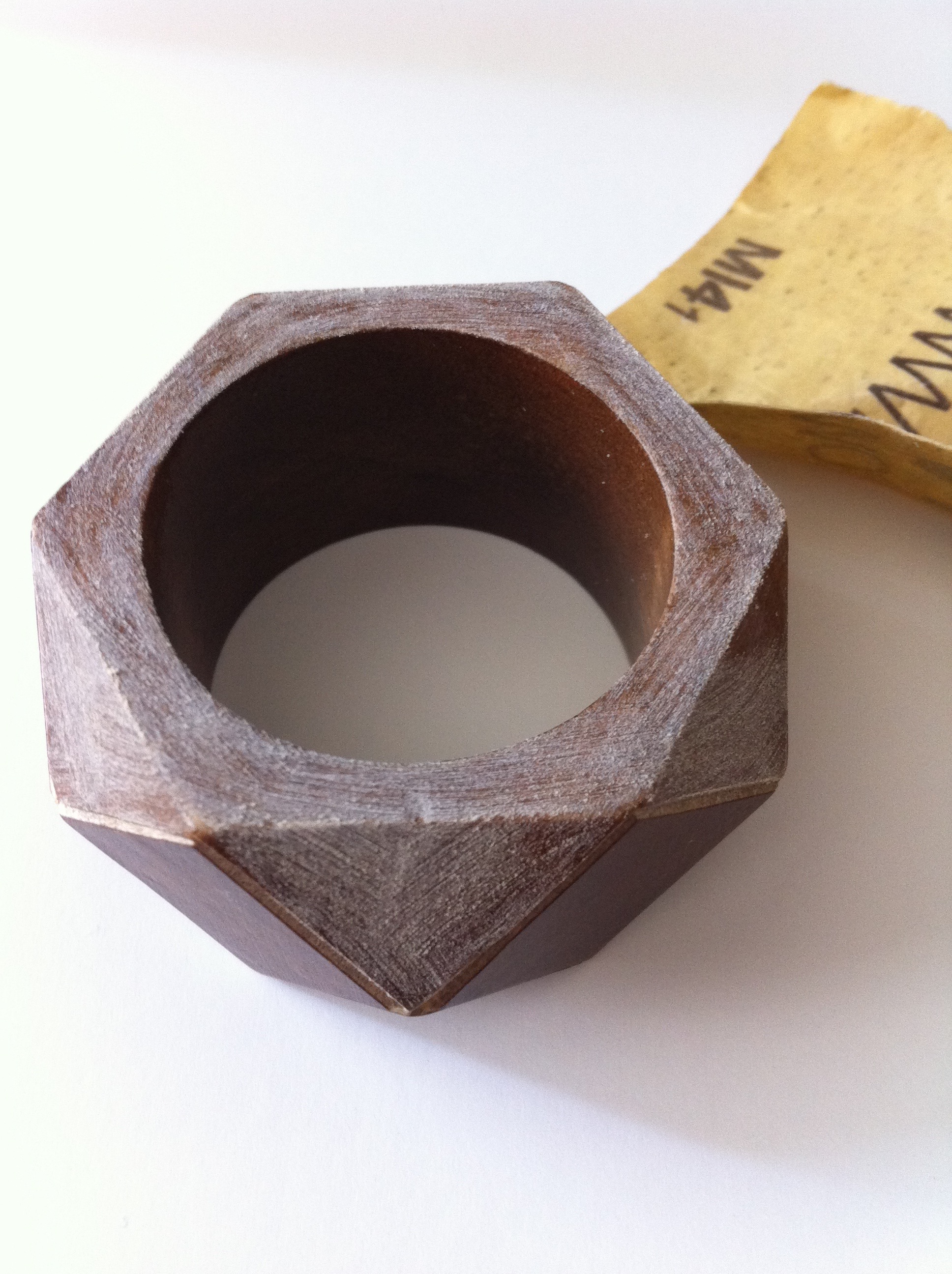
These vintage wooden napkins were an amazing find on Etsy. Aren't they gorgeous!? I was tempted to abandon my plan of painting the facets because they were so beautiful but I'm glad I followed through because I love the finished product and I think you will too! 

Here are the before pictures:

I love the lighter lines between the facets and the wood tone is so rich and warm!

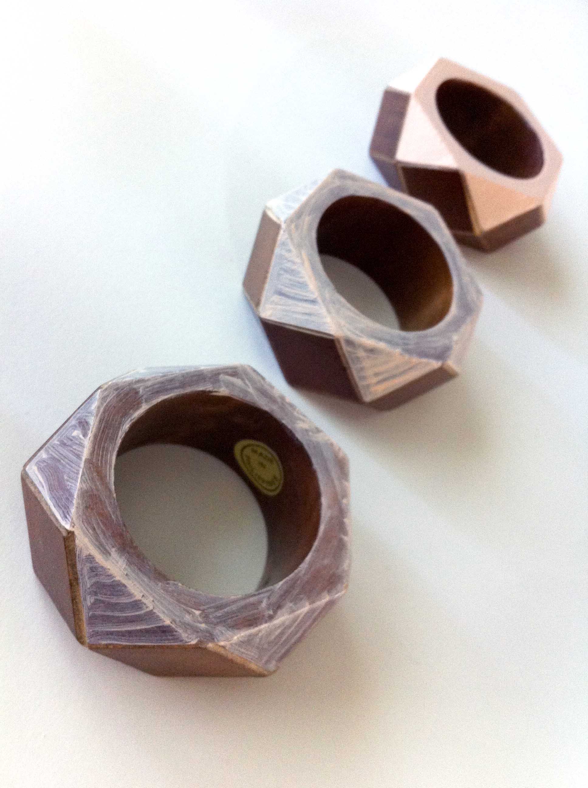
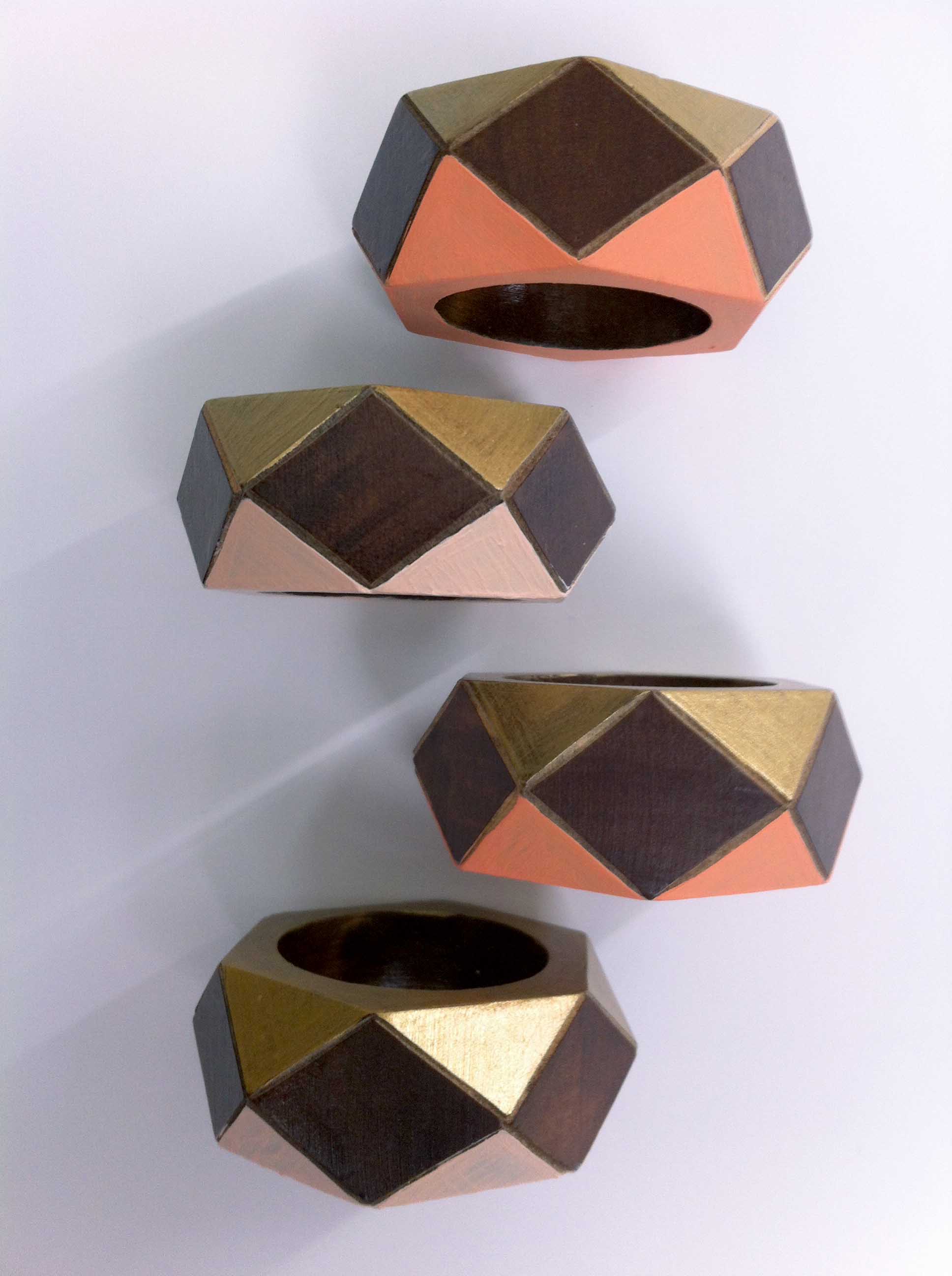
To get started, I used a small piece of 220 grit sandpaper to gently scuff the surfaces I wanted to paint. After a good wipe-down I started painting the first side of the napkin rings. I chose a light peach and darker coral and did 4 of each color. When those were all dry I flipped them over and did the opposite side of all 8 in gold metallic. These colors are great for fall and will pair beautifully with the other pieces we are making to use for our fall dinner party. (Stay tuned for those posts!) When purchasing or re-making items I really strive to get multi-season use out of things. I'm excited that these will also look great paired with pastels for spring or bright colors for summer picnics. 

All of the paints were acrylic craft paints, but of the three, I had the hardest time with the light peach. This may have been because it was the lightest and, as you can see, the wood is quite dark, but I also think it may have been because it was a satin finish. It showed brush strokes, left ridges even with suuuuper light coats, and it took more coats overall to cover. I think next time I would stick to a more matte finish and add gloss overtop if needed.

Ok, friends--light a fall-scented candle, pour some pumpkin spice coffee, jump over to Etsy to pick out some wooden napkin rings, then choose your colors and get painting! When you're done, pin your pictures to Pinterest and tag 5 O'Clock Design in the comment so we can see your masterpieces!

Geometric Lamp Makeover

See how these lamps went from outdated orange to gorgeous gold, PLUS, how to use your Ikea Expedit shelving as a home office!
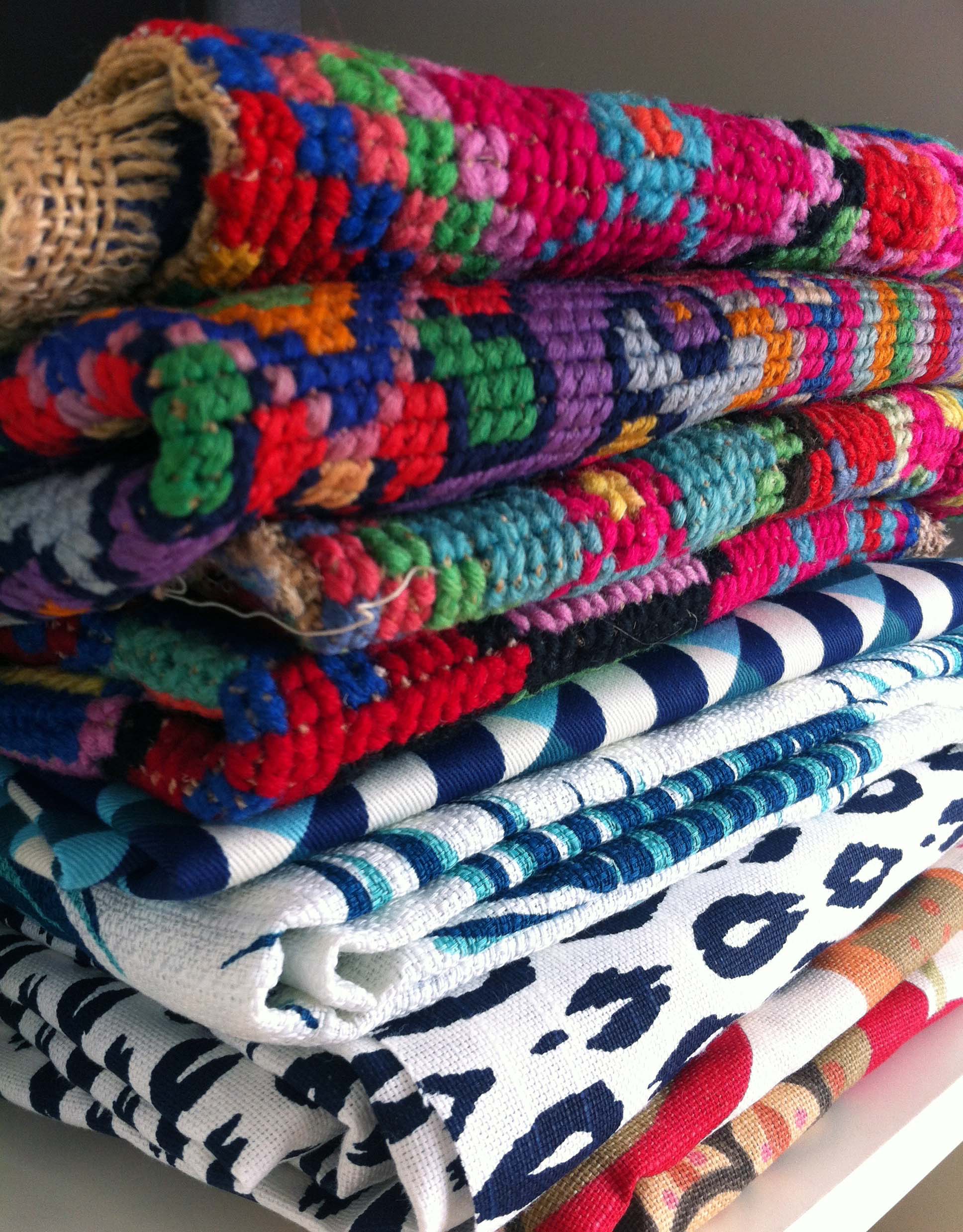
We all have those things in our home that we've fallen out of love with. Our style changes, the season changes, or something just isn't functioning well in a space. It can be expensive (and wasteful) to constantly be buying new things, but it's also no fun to feel stuck with things you don't love. This is when I love trying to re-purpose or refresh something I already own. Often this means altering the look with paint, fabric, etc but other times it just means changing where or how I'm using a particular piece. 

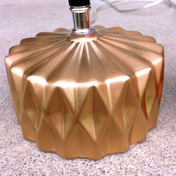
These lamps honestly weren't terrible to begin with. I bought them this color on purpose and used them happily for a few years before I grew tired of the bright orange. While I was ready to be done with the color, I still loved the shape and character. So I turned to my beloved gold spray paint to give them a new look.

Here is what they looked like after the second coat of paint. I did not use a primer, just cleaned the lamps well. The paint adhered well and covered nicely. I thought I wanted to seal the lamp and give it a high-gloss look, so I proceeded to apply a few coats of clear spray acrylic. 

This is what it looked like with the clear gloss. ICK! Again, it's really not awful, it just isn't what I was going for. It feels kind of flat and dull.
*A note about the clear gloss--if you decide to use it, don't freak out if it looks cloudy-white going on! I panicked, but as it dried it cleared right up.

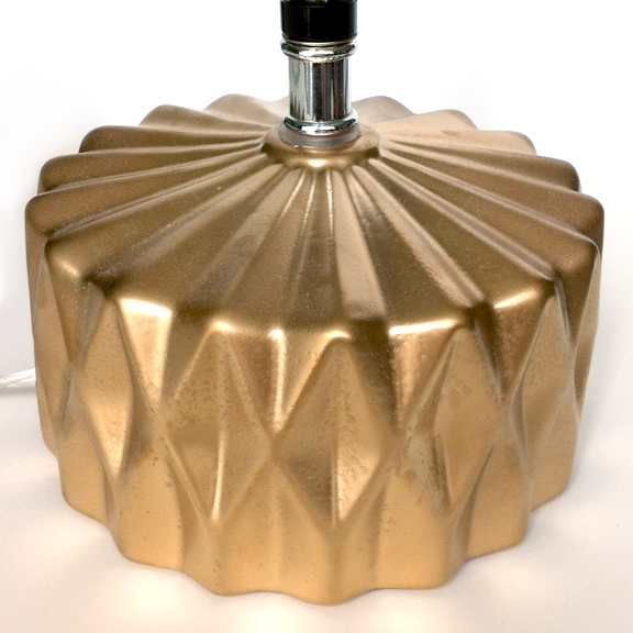
So... back for another round of straight gold spray paint and it's perfect again. I love the gold foil look and the subtle character of the finish. 

With the lamps looking so classy, the shades needed a little re-vamp too!

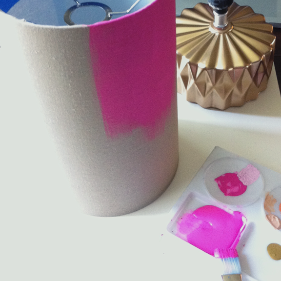
The linen shade was really beautiful and classic, but it looked out of place with the new gold color. It seemed a little casual and there was absolutely no contrast. I taped off the edges so I wouldn't get paint on the white interior and then went crazy with this "Diva Pink" color.

This is the first time I've tried painting a lampshade and I was so nervous I was going to ruin it. I kept meaning to buy an additive that is supposed to turn any paint into fabric paint but never got around to it. Eventually, I decided to just try it! This is just straight acrylic craft paint and it worked beautifully. I applied the paint with a brush and only did one coat so as not too obscure too much light.

And finally, how the lamps worked with my humble home office!

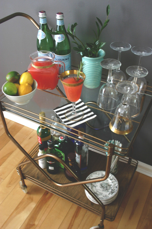
I know, I know, "home office" might seem like a stretch, but since I do a lot of work right at our dining room table, I needed a place to store the things I use most often. We were using sections of this Ikea Expedit shelf as a bar, but once I finished this bar cart project it became kind of a catch-all for books, a few picture frames, and toys. I decided to re-claim it and make it a more functional work space! 

What do you think--hit or miss with the new look for these lamps? Comment below and tell us what you think of their transformation!

Color Crush: Jewel Tones

The last days of summer are slipping through our fingers and autumn is nearly here; what better way to bridge the gap between these two seasons than deep, rich, vibrant jewel tones?! I've rounded up some of my favorite uses of these gorgeous hues to inspire your end-of-summer creativity.

*If you like these pictures as much as I do and want to pin them to pinterest, please be awesome and click on the pictures then pin from the original sources. Thanks!

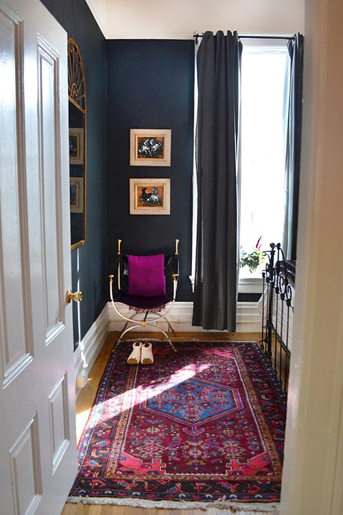
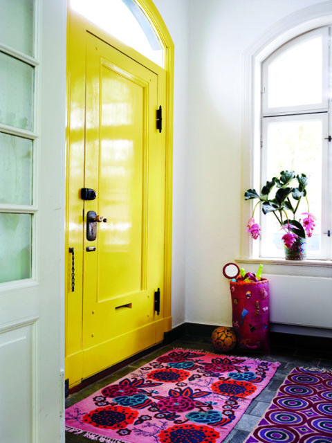
2. The deep, dark blue of these walls is warm, sultry, and mature. The bright pinks, blues, and reds of the rug provide a cheery, while sophisticated, vibe and the magenta throw pillow pulls it all together.

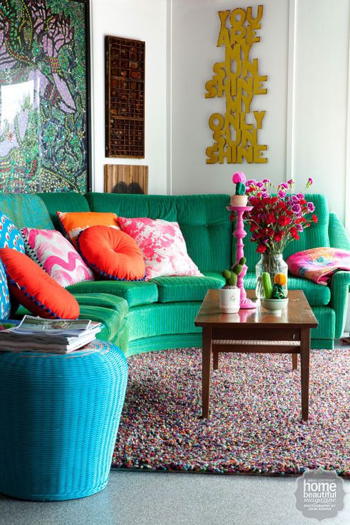
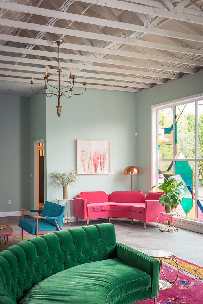
1. There's just something about a green velvet sofa that gets me ever time. Here it plays well with the myriad of other bright colors and is balanced perfectly by the green art and white walls. 


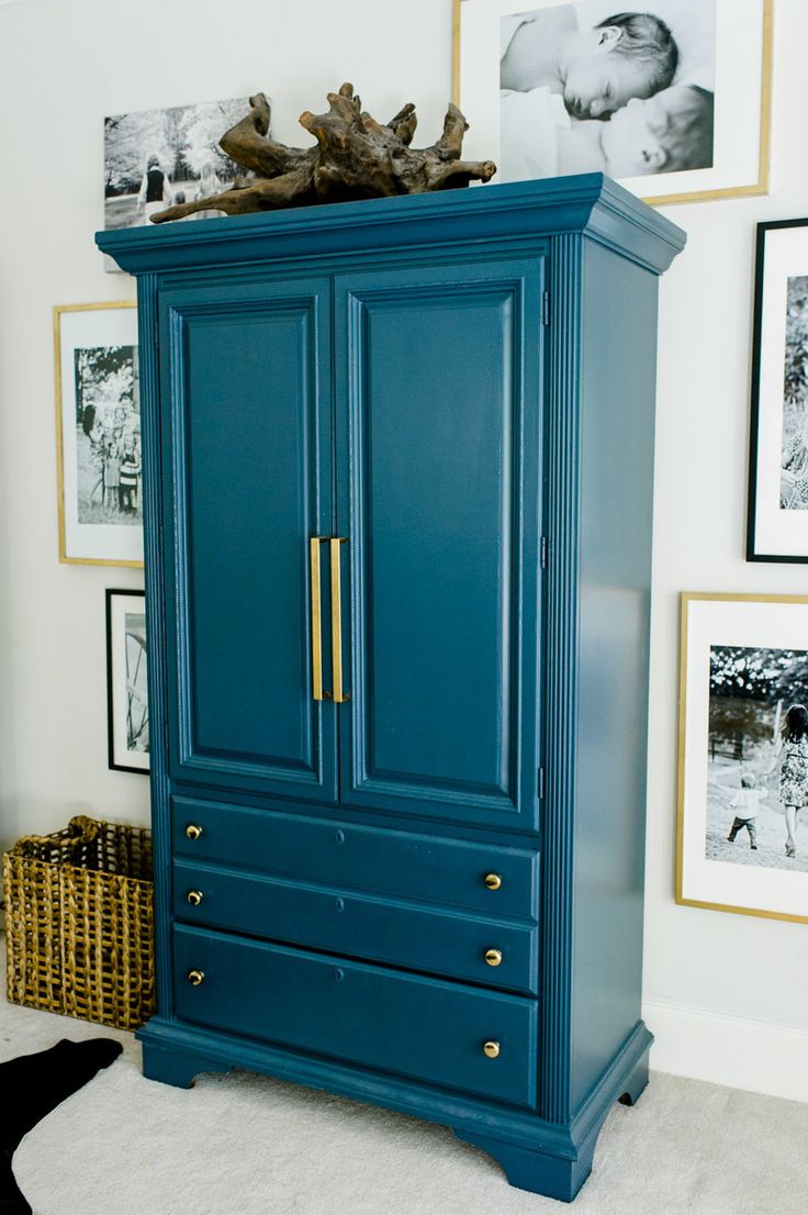
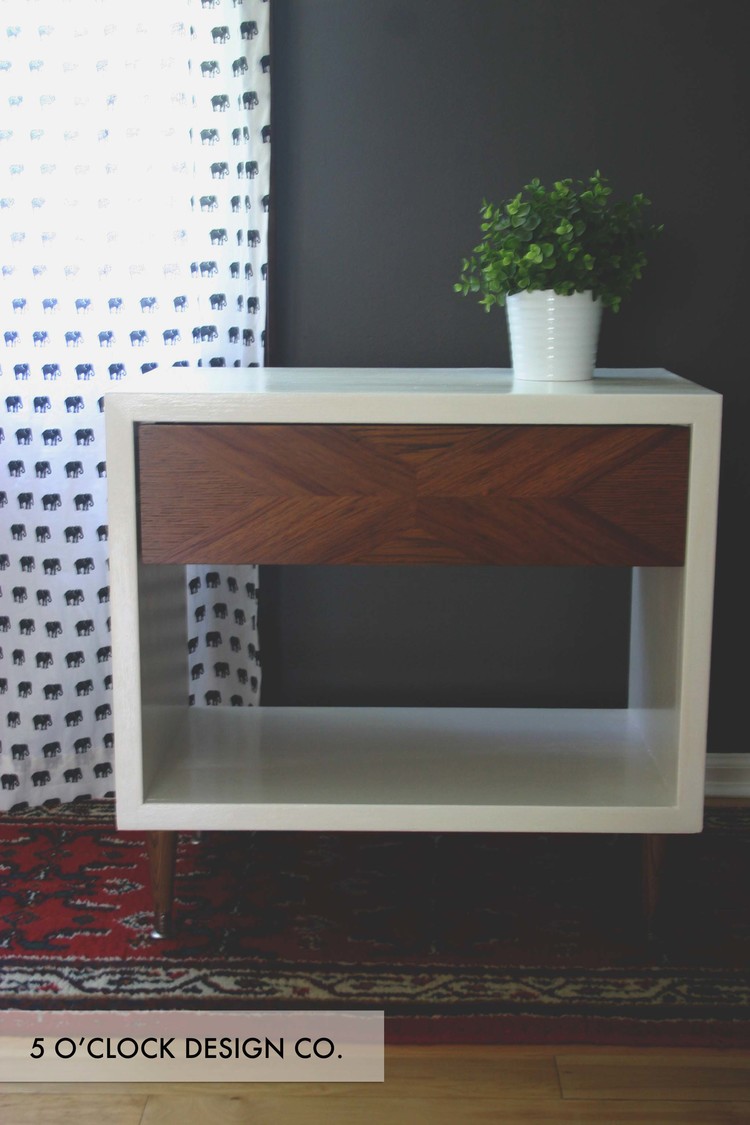
4. If you're still feeling a little shy about this color palate, try getting your feet wet by starting with a single piece of furniture. Pick your paint, add a little brass hardware, and voila! You're part of the awesome club! 

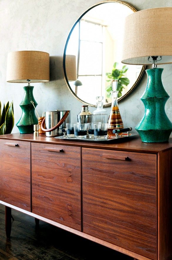
3. I know this post is about jewel tones, but let's talk for a minute about how nicely they pair with rich, warm, wood tones. These emerald lamps with this credenza are classy, elegant, and fun all at the same time. 

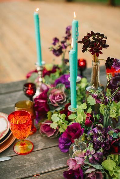
6. Jewel tones aren't just for your walls and furnishings, folks! This stunning table would be perfect for a summer/fall wedding or even a glamorous backyard picnic. I really appreciate that even the dishes play an active role in the color harmony happening here. 

5. I love how this furniture looks paired with the pastel blue wall. It is the perfect blend of warmth and lightness. Details such as the artwork, stained glass, and plants, reinforce the color palate and motif beautifully. 


So there you have it--wouldn't you agree that these colors kind of rock? I'm definitely feeling inspired to look for ways to incorporate more of these hues into my home! Comment below and share where your favorite places to use jewel tones are!


You Might Also Like These: 


Back to School Shopping: Shop For a Cause

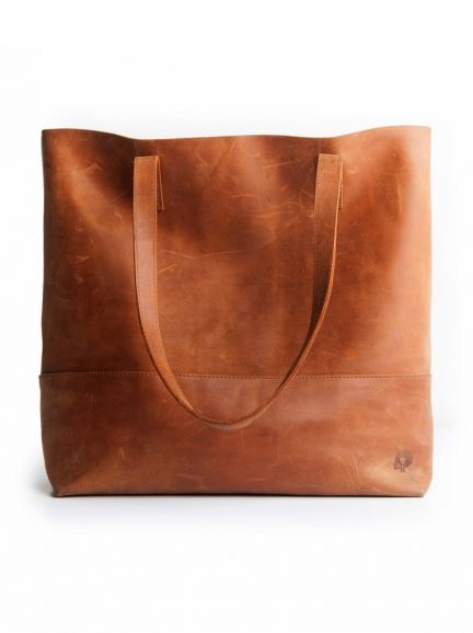
It's time for back to school shopping and even if you aren't actually headed back to classes this fall, it is the perfect time to pick up one of these amazing pieces. The thing I love about buying from these organizations is that, in addition to treating yourself (or someone else!) to a little present, you are supporting an amazing cause. Here, your purchase makes a difference--YOU make a difference!

Whatever this fall has in store for you: classes, work, travel, or loving on little ones, do it in style and make a difference in the lives of others at the same time. 


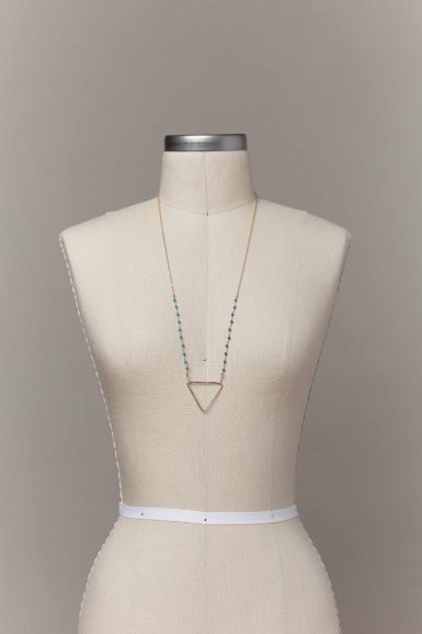
FashionAble

At FASHIONABLE, we believe our role is to INVEST IN A WOMAN. When a woman is empowered with work to do, whether in the home or in an office, she not only experiences the joy and satisfaction of developing a skill, she also creates change in those around her. FASHIONABLE’s role in this story is working with women, both locally and globally, who have overcome challenges ranging from prostitution to addiction to a lack of opportunity. Every one of us understands what it means to overcome, and we are all ABLE to find purpose in the work we do.
— livefashionable.com

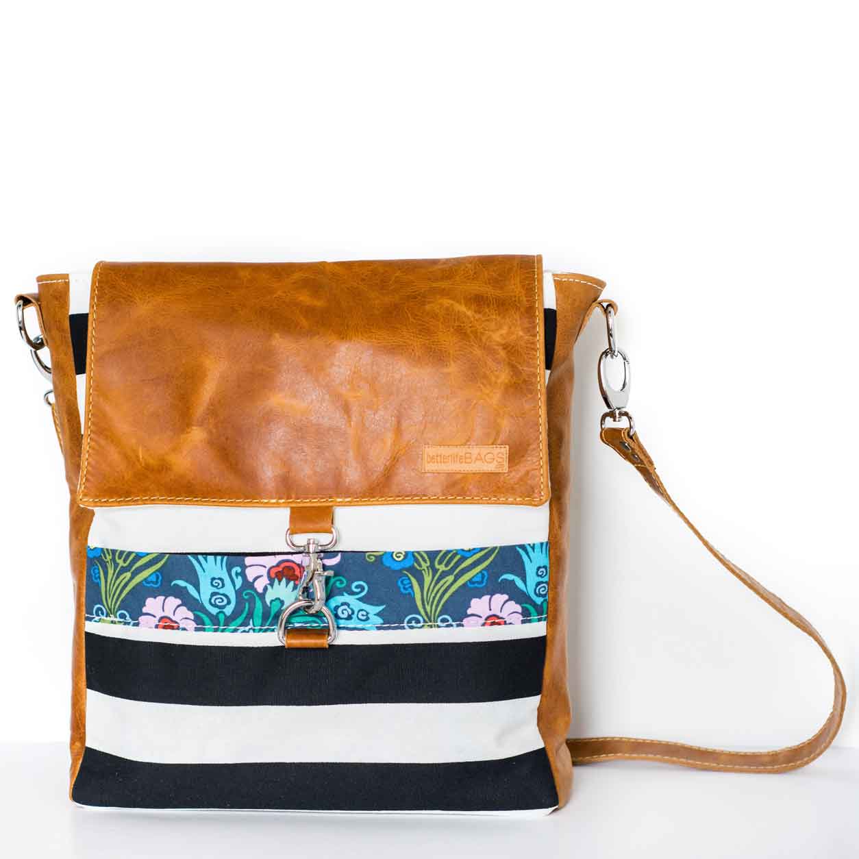
Better Life Bags

Our mission is to hire women who have various barriers to employment to make our custom leather and fabric bags. They are adopted into our Better Life family and given a chance to succeed in life, family, and friendship... We really believe we have created a unique business that brings together YOUR design efforts with tangible needs in our community of Detroit, Michigan. Every bag we sell means more women that we can hire!
— betterlifebags.com

Ophelia's Place

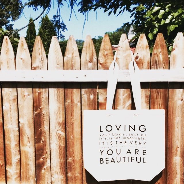
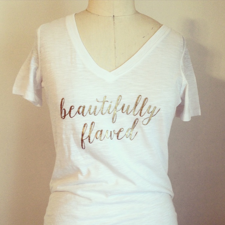
Our mission is to redefine beauty and health by empowering individuals, families, and communities impacted by eating disorders, disordered eating, and body dissatisfaction. Our Vision is to change culture and to empower individuals, families, and communities to embrace health, beauty, and happiness. The message of body celebration applies to every body, which means every person, of every shape and size.
— opheliasplace.org